
3rd-Party Visualizations in OBIEE Part 3
In Part 1 of this post, I wrote about why you might want to add third-party visualization capabilities for OBIEE and gave a brief explanation how to setup one approach: calling java visualization engines. In Part 2 I walked through a detailed example of how to actually do this using a visualization engine called Flot. In this post I will do the same thing for a visualization engine called D3.
Where Flot would be used mostly for having more control and interactivity over pretty standard visualizations available in OBIEE today, D3 can be viewed as venturing into the wild world of more avant garde visualizations. Take a look at the Examples page on the D3 web site and you’ll feel like you’re in an alien world. In addition, D3 is a bit more complicated than Flot, with a good comparison being R, both in its complexity as well as the community growing and expanding D3 in many directions.
In an effort to introduce you to working with D3 in OBIEE, I’m going to start small. After advertising a variety of cool and crazy visualizations, I’m going to start with a simple bar chart and work up to bullet charts at the end. There is more of a building progression in this post than in Part 2, so stick with me.
What’s different about D3 is that it’s less of a “charting engine” and more a sophisticated way to graphically paint data. That may sound like an abstract differentiation, but hopefully you’ll see what I mean as we walk through this first simple example.
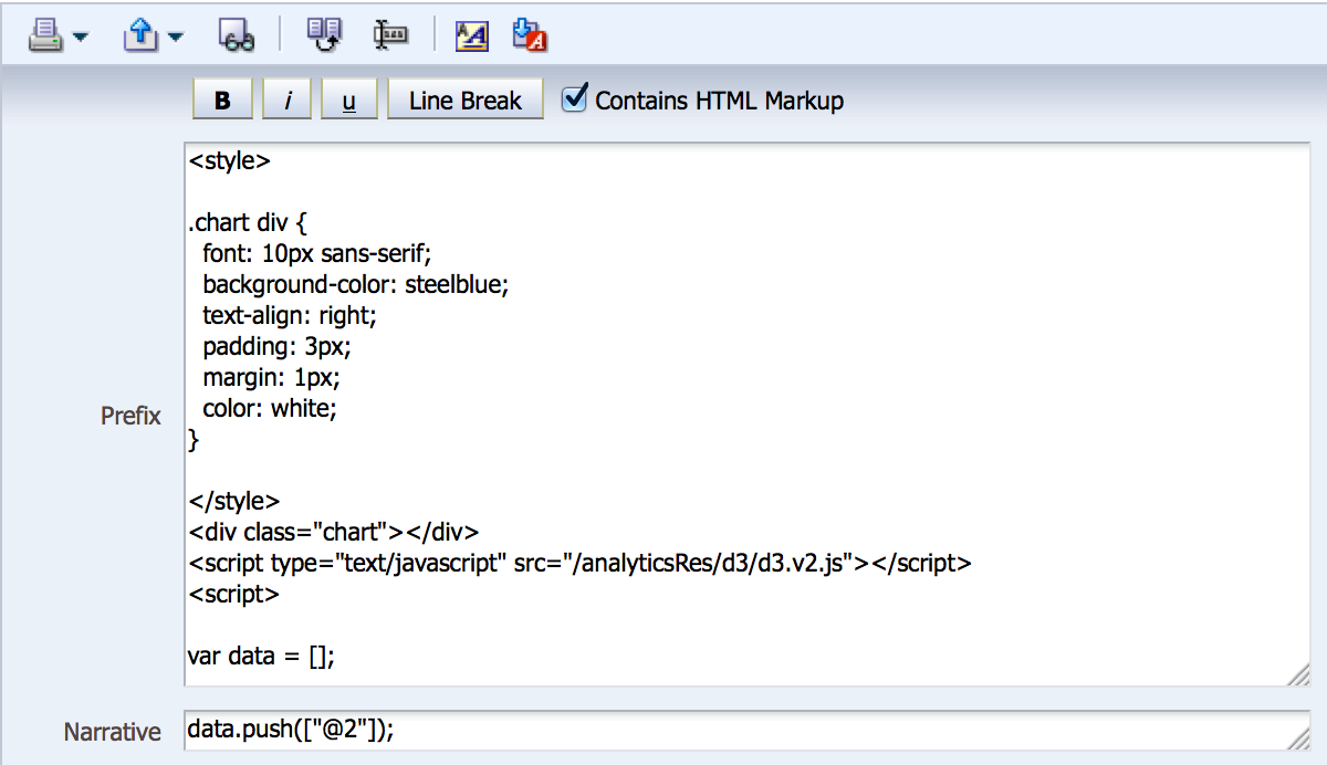
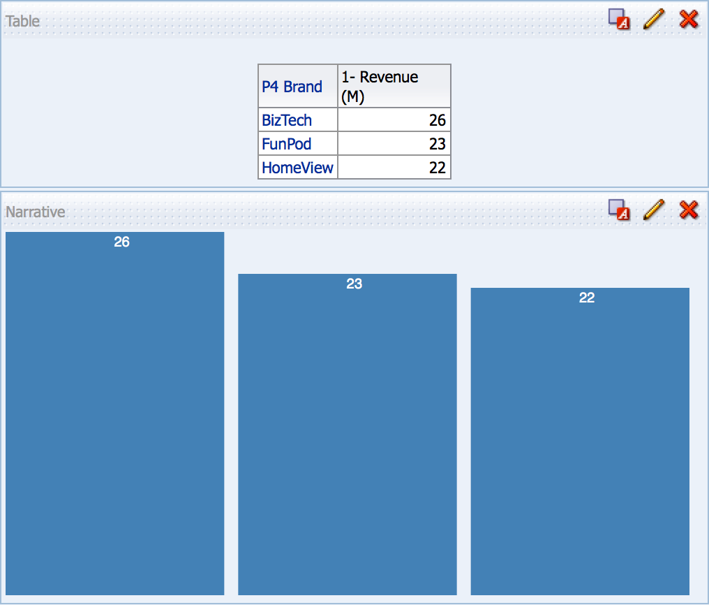
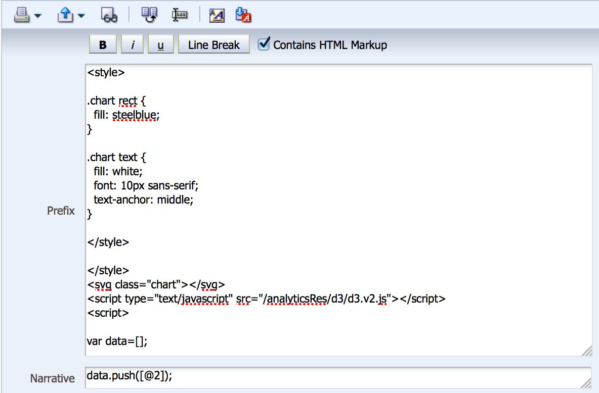
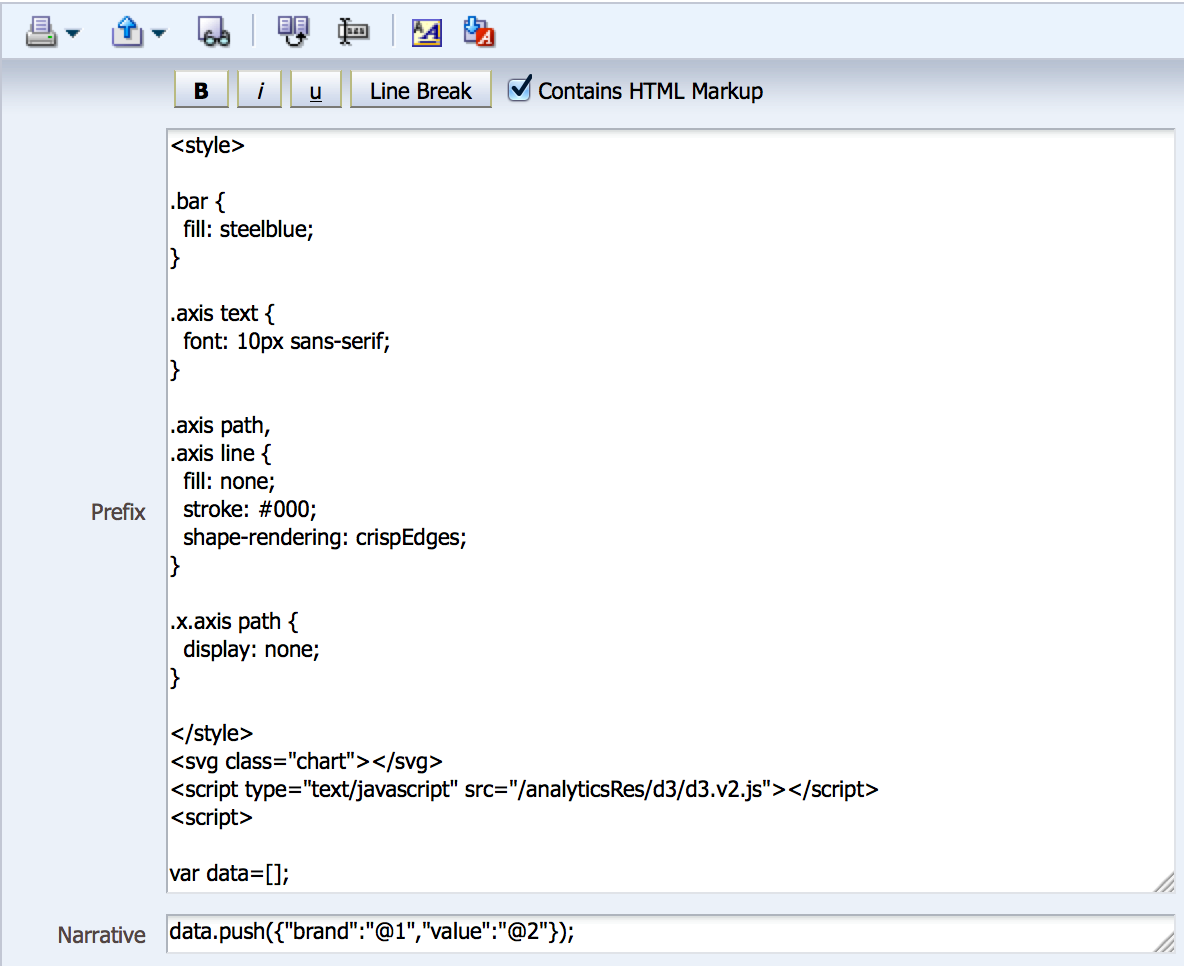
In the Prefix and Narrative sections for our first example, there isn’t much different from Flot. We can define CSS styles (or reference them in a separate file), we have to reference the appropriate javascript file served as an application on our server (in this instance, D3 was already deployed in analyticsRes on the SampleApp VM, so I’m referencing that here), and we need to initialize our data array. From there, our Narrative section pushes data from the report into the array, and in this simple example, we’re only pushing the “1- Revenue” column.
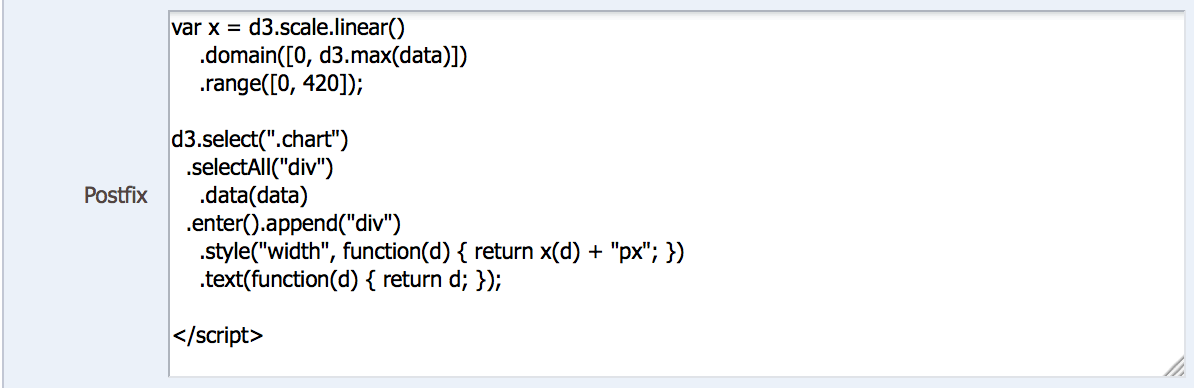
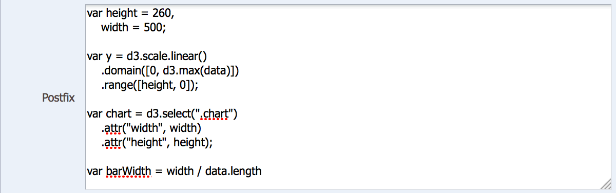
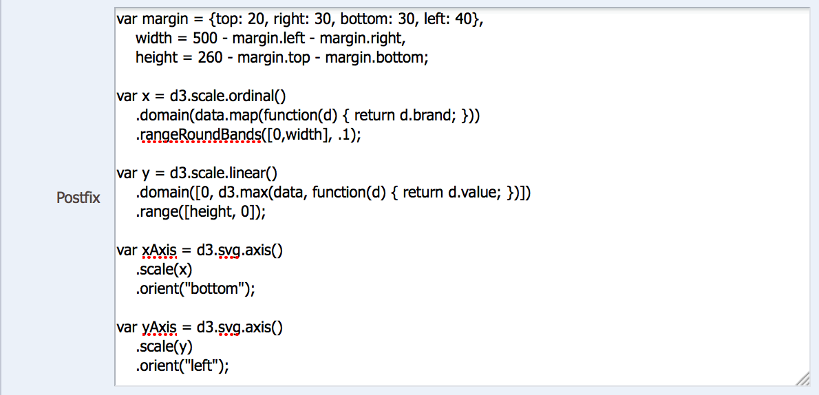
From there we jump to the Postfix section and we can see the simple structure that D3 follows. First, we’re defining a variable using D3 linear scaling that defines the domain (data-driven, input) and the range (pixel-driven, output) for the chart. This allows D3 to map whatever data range your data has to whatever pixel space you have to draw the object.
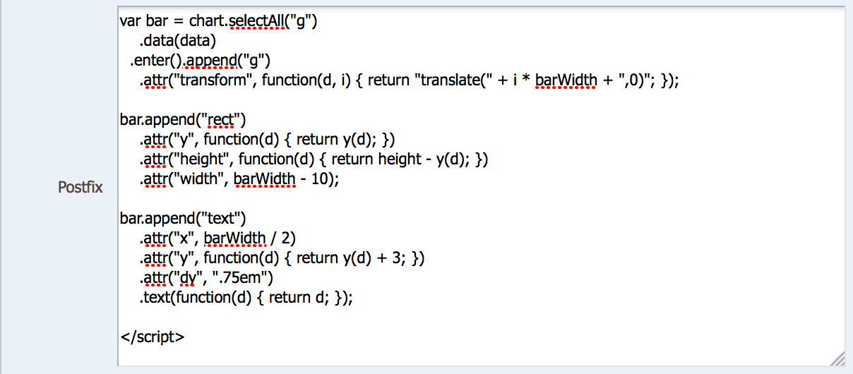
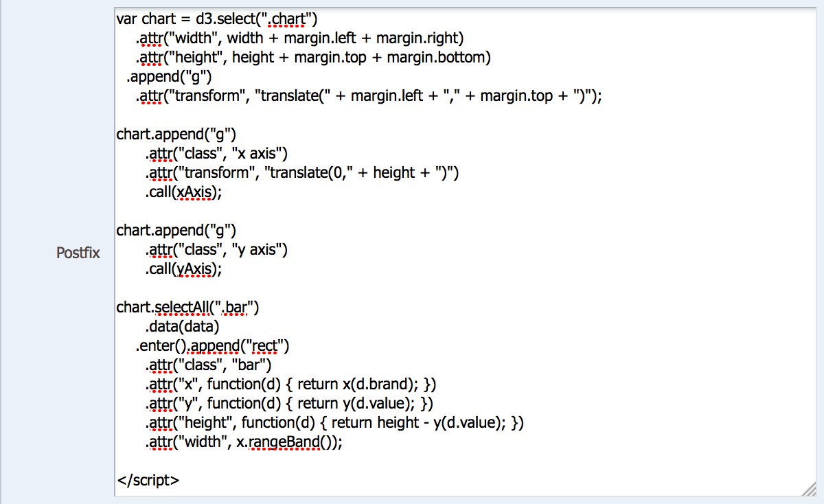
Next, we perform a D3 “select” statement that appends each bar in the chart using the defined style and a width based on our data. This select statement will vary based on the type of visualization you’re working with, but the key thing to note that you are literally defining how to “paint” each part of the chart — we are literally drawing boxes with a text label on them, not a bar chart. To get a better understanding of this, let’s evolve the chart a bit and actually pivot it from a horizontal bar chart to a vertical one.
For simplicity’s sake, I’ve added a simple calculation to represent our “1- Revenue” metric in Millions, and you can see the chart is now flipped to a vertical bar. But there are also other subtle differences in this version — let’s take a look.
The Prefix and Narrative sections look similar to the first example, with a mild change to the CSS structure. But there is also another difference in that we are rendering the chart in SVG (Scalable Vector Graphics) instead of pure HTML. From what I read, SVG is more flexible than HTML and will actually make it easier for you to render more complex visualizations, but I can’t say I have a lot of first-hand experience with the pains of one vs. the other. Feel free to Google more on this if you’re interested.
In the first part of our Postfix, we’re going to define variables for the canvas heigh and width, as well as a variable for our domain and ranges of the chart. Notice that since we’ve pivoted from horizontal to vertical, our range definition changes from (0,width) to (height,0). Next we’re going to initiate our D3 select, but we’re going to put it in a variable and define two SVG attributes, “width” and “height” for our bars. This is the difference in using SVG versus HTML. Next we define a “barWidth” variable that takes into account how many bars of data we have to draw (data points) and divides the chart space up accordingly so our bars are proportionate to the space and each other.
Now here’s where things get interesting and different. First, we’re going to reference our original chart variable and tell the chart to draw each bar using the SVG transform/translate combo to basically tell the chart to paint each bar from right to left taking into account the proportionate barWidth for each bar. Next we call an SVG “rect” to create the bar height by taking into account the difference between the canvas height and the data height because SVG objects render from top-to-bottom, not bottom-to-top as you would expect from a vertical bar chart. We also want some gaps between each bar, so we subtract 10 from the barWidth to set the “rect” width. Lastly, we can append a text label in the middle of the bar, at the top inside the bar, but with just a little bit of padding between the two. As you can see, there’s a lot to think about here, but like I explained before with Flot, it’s always good to start out with pre-defined code somewhere and tweak accordingly (unless you’re already a savvy javascript writer). Now let’s get a little more complicated.

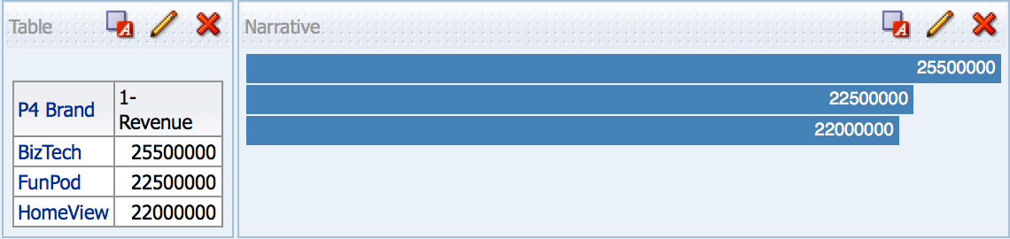
Axis labels?? Now we’re getting fancy! Seriously, though, the point of this is to show how much manual control you have over these visualization types, but how that can be a double-edge sword with regards to how much you have to manually account for (makes you appreciates OBIEE charting engine, doesn’t it?).
The main thing you’ll notice different here (other than the CSS additions to help with the axis formatting) is the addition of a second value in our data array. In the Narrative section, you can see that we now have to pass labels into our data array so we can reference specific data values, much like we do columns in OBIEE. The key here is that we aren’t passing a static file to D3 (like many websites do), so we can’t rely on traditional csv row headers.
First, we’re going to set some basic margins so that our chart doesn’t take up the entire canvas and we leave room for our x and y-axis labels. Next, we need to leverage a D3 ordinal scale because the “Brand” values are not numeric and instead of a plain range, we need to use rangeRoundBands to get the integer width of each bar. For our y-axis, we can use the D3 linear range we used before to fit our data values within a pixel space. Then we can define a variable for each axis using standard SVG functionality.
All that’s left is to run our D3 select, append our two axes, then draw the rects for each value, making sure to align them with our brands in our x-axis. When you think about having to draw each object in the canvas, it really helps then to compartmentalize the different parts of a chart, much like you do in Excel.
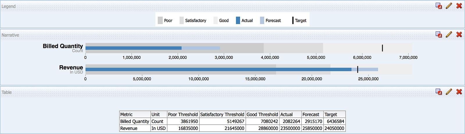
So what about venturing off the reservation to something you can’t easily accomplish in OBIEE? Let’s look at the Stephen Few favorite: the bullet chart. Right off the bat you’ll see how we’re dealing with many more measures above, because at it’s core, the bullet chart spec contains a metric label, a metric, a comparative metric, and a few range scales. Thankfully, a few people took Few’s spec and coded script to replicate it. All you have to do is some standard D3 coding and make a few calls to this code. Let’s break down how I got to this output.
First, SampleApp contains an example bullet chart. However, Oracle complicated the execution of this example for my tutorial purposes, so I set out to simplify it. I did this in four main ways:
- Removed the bullet chart-specific code from the Postfix section and called it in a separate javascript file, as is consistent with the examplereferenced on the D3 site (the same example Oracle based their example on).
- Removed the superfluous code that allowed the D3 example to generate new random data using a button on the chart.
- Changed the logical SQL of the report to simplify the data being retrieved, as Oracle’s example allows for interaction at an individual product level and thus creates more complications in working with the result set. I also changed many of the calculations for the various metrics to simplify them as well.
- Changed the legend to reflect my changes to the logical SQL.
If you want to replicate what I’m about to do, you’ll first want to start with a new report. Here is the logical SQL:
SELECT saw_0, saw_1, saw_2, saw_3, saw_4, saw_5, saw_6, saw_7 FROM ((SELECT ‘Revenue’ saw_0, ‘In USD’ saw_1, “Base Facts”.”5- Target Revenue”*0.7 saw_2, “Base Facts”.”5- Target Revenue”*.9 saw_3, “Base Facts”.”5- Target Revenue”*1.2 saw_4, “Base Facts”.”1- Revenue” saw_5, “Base Facts”.”1- Revenue”*1.1 saw_6, “Base Facts”.”5- Target Revenue” saw_7 FROM “A — Sample Sales” WHERE “Time”.”T05 Per Name Year” = ‘2010′) UNION (SELECT ‘Billed Quantity’ saw_0, ‘Count’ saw_1, “Base Facts”.”6- Target Quantity”*.6 saw_2, “Base Facts”.”6- Target Quantity”*.8 saw_3, “Base Facts”.”6- Target Quantity”*1.1 saw_4, “Base Facts”.”2- Billed Quantity” saw_5, “Base Facts”.”2- Billed Quantity”*1.4 saw_6, “Base Facts”.”6- Target Quantity” saw_7 FROM “A — Sample Sales” WHERE “Time”.”T05 Per Name Year” = ‘2010′)) t1 ORDER BY saw_0, saw_1
Next, deep within the D3 folder hierarchy on SampleApp, there is an Examples folder which contains example code for a variety of different chart types. The bullet subfolder contains a bullet.js file, which you’ll need to copy, renaming the old file to “bullet_orig.js” and editing the new file to strip out the D3 rendering code at the top of the file. You’ll know where to stop deleting when you reach the part of the file that contains the following comment lines:
// Chart design based on the recommendations of Stephen Few. Implementation
// based on the work of Clint Ivy, Jamie Love, and Jason Davies.
// http://projects.instantcognition.com/protovis/bulletchart/
Save that file and you can now reference it within a new narrative view, which looks like this:
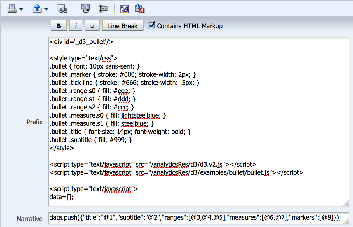
We start with some CSS unique to the bullet chart, call a second .js file (the one we just created), and our Narrative is a bit more complicated (notice how each column does not need its own label).
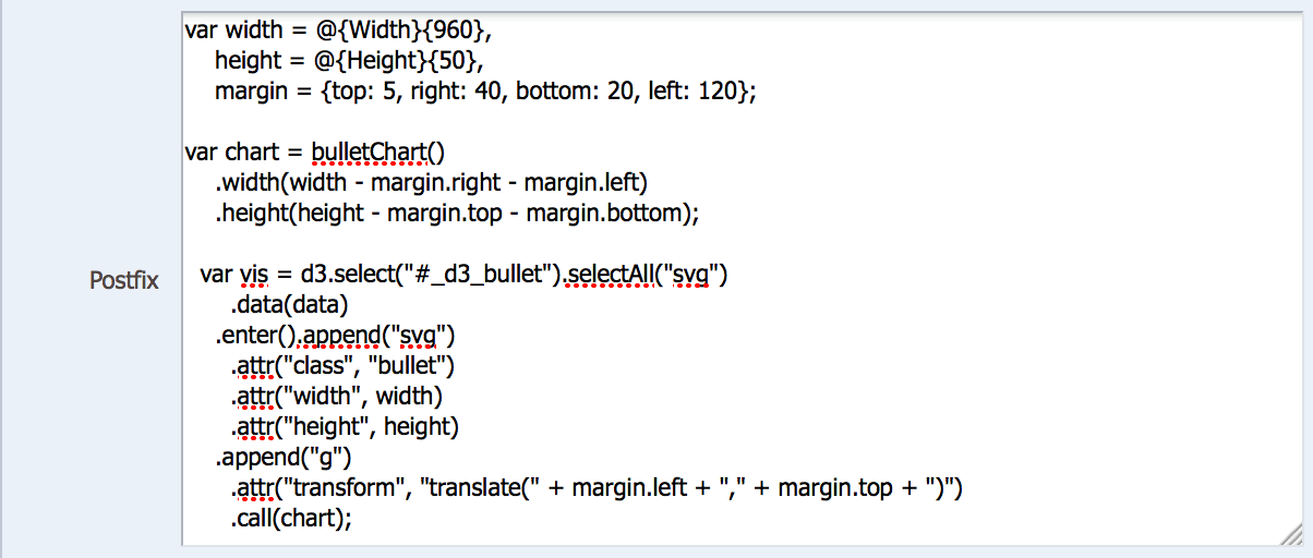
In the first part of our Postfix, there isn’t much different from what we’ve seen before, with the exception of the bulletChart() function call, which is defined in the bullet.js file. There is a lot of code there, and thanks to the people who created it, we don’t have to write that from scratch every time we want to create a bullet chart. Since this function does most of the work, the rest of the Postfix code is rather straightforward.
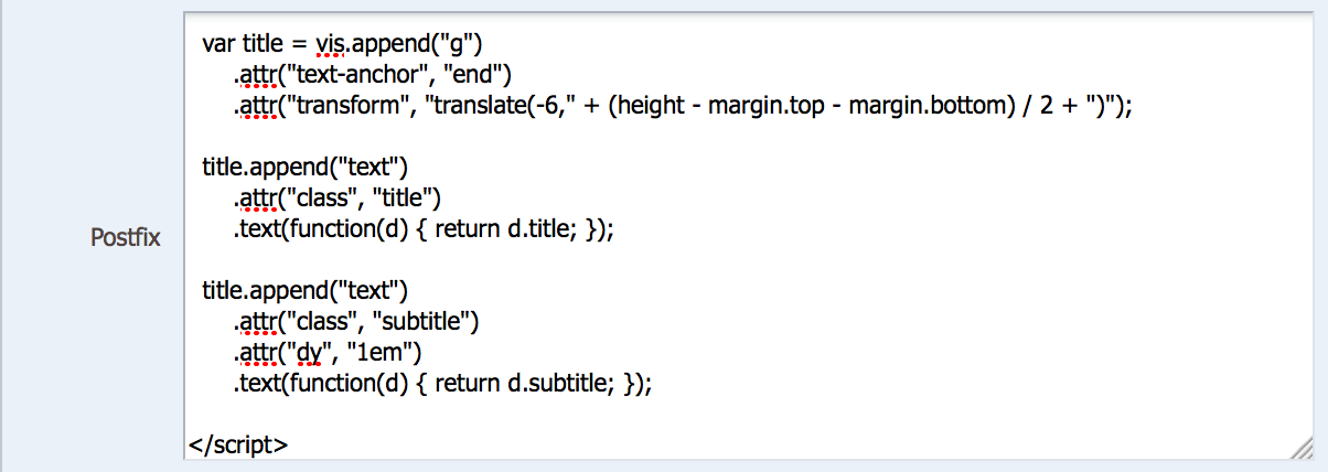
Once the chart is called, the only work left to do is to append the title and subtitle text to the side of the chart, which we do with the code above, which is largely similar to code we’ve seen before.
And that’s it! I repeated the final product above for your reference again, as you’ll need to build your own legend view to explain the parts of the graph. There are lots of uses for this type of view, but the standard actual-versus-target is the most obvious. You can also build-in hover capabilities, navigation link capabilities, and more — but that’s for the advanced class!
That concludes this three-part series on 3rd-party visualization in OBIEE. I hope this provided you with enough of an introduction to put you on the path to doing this in your own environment.