
3rd-Party Visualizations in OBIEE Part 1
It’s been awhile since I’ve posted anything substantial, so I thought I’d blogify the presentation I gave at the BIWA Summit and also plan to give at both the 2014 BI Forum in Atlanta as well as the upcoming Kscope ‘14 in Seattle.
The presentation is entitled “Adding Third-Party Visualizations to OBIEE” and it revolves around the blossoming world of data visualization. Whether you’re a Stephen Few fan or foe, it’s hard to ignore the weight that more advanced and more interactive visualizations carry in today’s data-centric world.
Sadly, OBIEE’s visualization capabilities haven’t advanced with the times, and while we have received updates like waterfall charts, trellis charts, and performance tiles, there are still ways in which Oracle could both improve the existing visuals and add new ones. Fortunately, there’s a way to complement Oracle’s out-of-the-box visualizations with third-party visualization capabilities. In Part 1, I’m going to write about why you’d do that (and how you’d get started), and in Part 2 and Part 3 I’ll deep-dive into some examples.
I’ve already touched upon why you would do this, but I’ll break it down further into three discrete reasons with a single example in each one. I give many more examples in my presentation, but for the brevity of the blog, I’ll stick to one for now.
1. Add new capabilities to existing OBIEE chart types
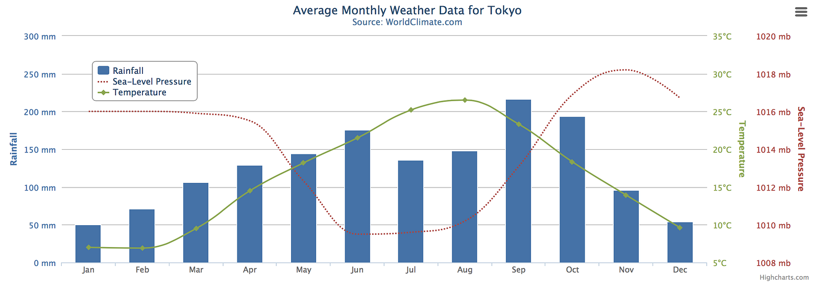
How many times have you received a request that you just couldn’t meet with OBIEE’s chart types because Oracle didn’t give you enough ability to customize the chart? The example above shows a line/bar combo chart, which OBIEE supports just fine. However look closely at the chart above and you’ll notice a third Y-axis off to the far right for “Sea-Level Pressure.” Try as you might in OBIEE, there is no option to put a third distinct Y-axis in a line/bar combo chart. Oh sure, you can map three metrics, but if the metrics don’t have the same unit of measure or the same scale, you’re screwed. As an added bonus in the chart above, the legend actually overlays on the chart itself, saving space.
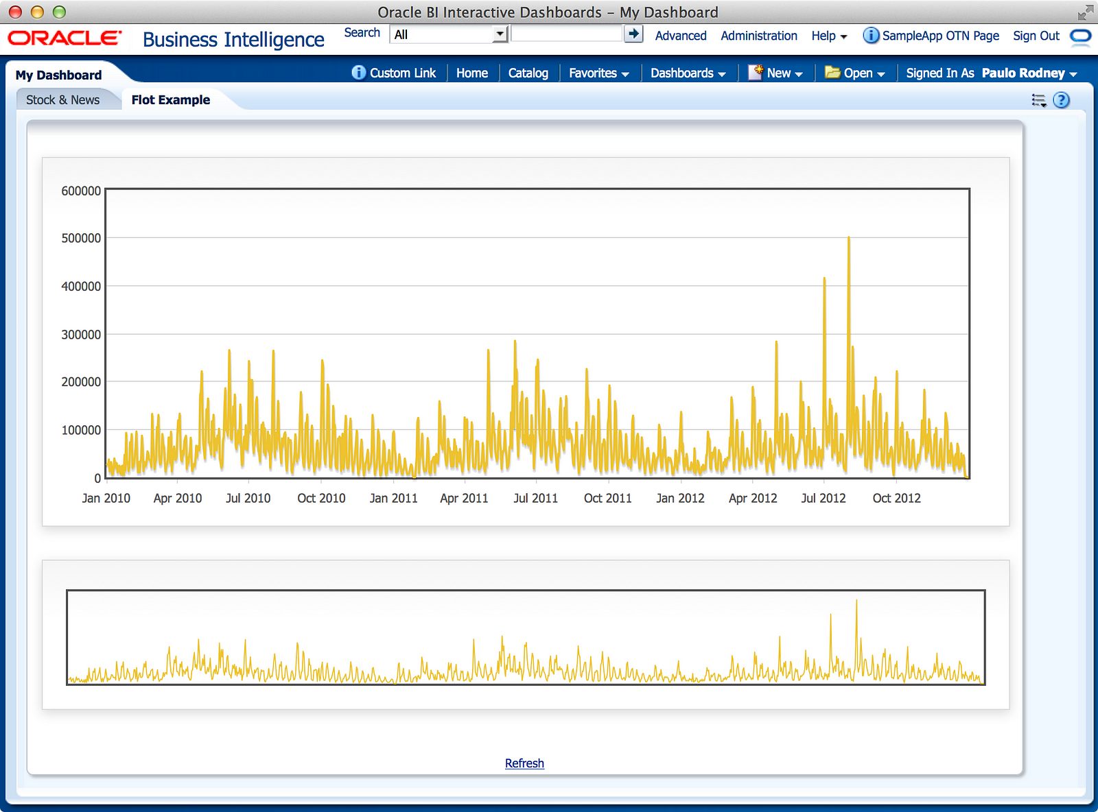
2. Add more interactivity to existing OBIEE chart types
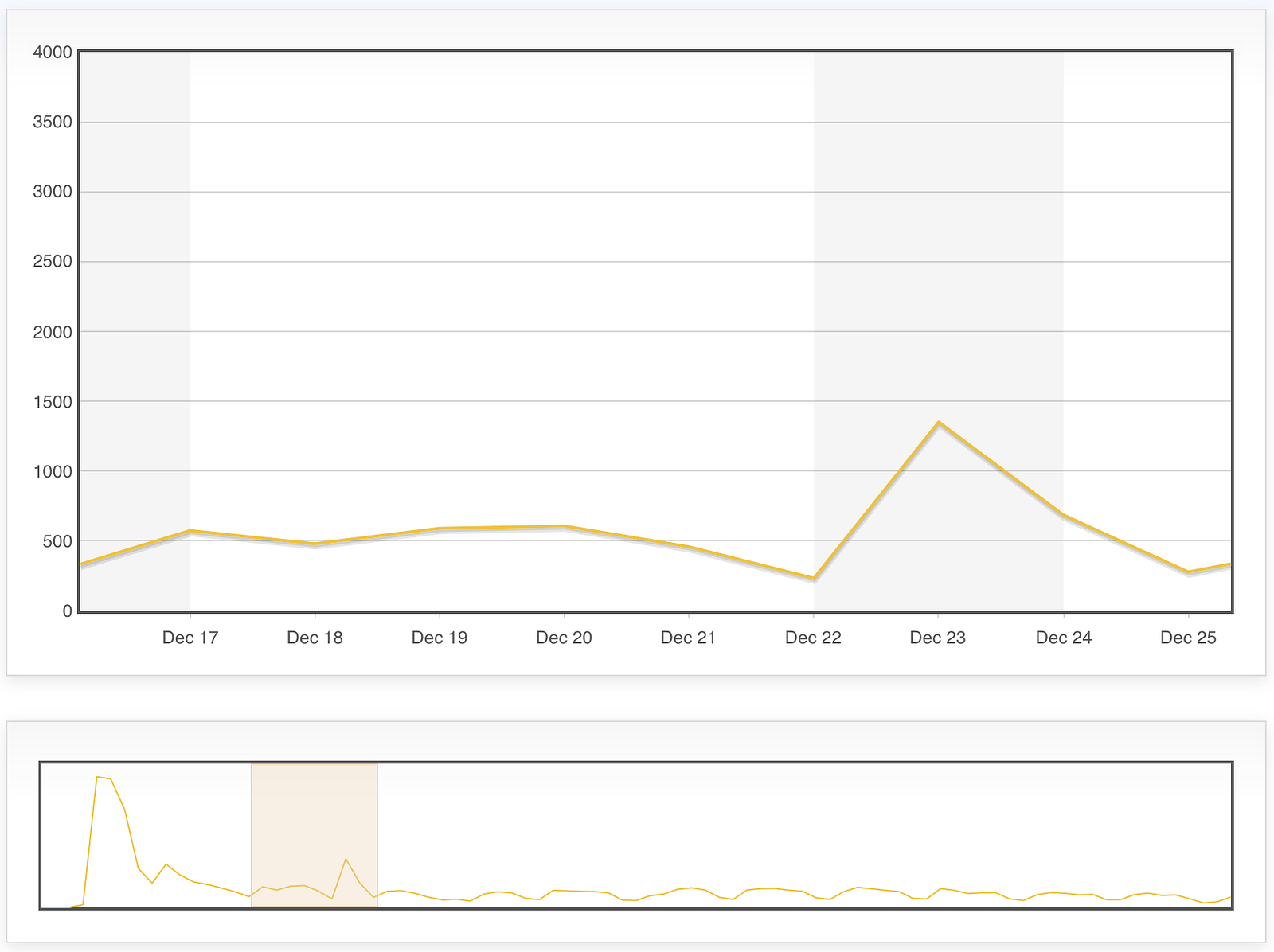
It’s very common in Business Intelligence for us to visualize data over time, specifically using a line chart. Unfortunately, fixed chart sizes don’t always handle very granular or voluminous data very well. While OBIEE has the “zoom” feature that allows the user to customize the zoom of the X and/or Y-axis, that feature isn’t quite as slick as it could be. The above screenshot demonstrates the value of two linked line charts of the same data: one meant to show a simple trend over the entire duration, and one meant to show the details of the selected range in the first chart. Yes, that’s right: you can drag a range on the lower chart, and the upper chart will reflect just that range. Try doing that in OBIEE (actually, I’ll show you how to do this in Part 2)!
3. Add brand new visualization types
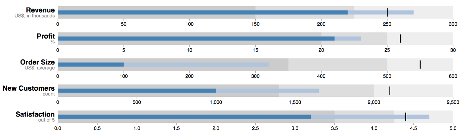
It’s a shame that I’m only showing one example per reason, as there are many cool examples I could include here, but the basic premise is that you’re adding a brand new chart type. From bullet charts (above) to calendar views to timelines to sunbursts to treemaps, the options are endless. More importantly, you aren’t locked into very generic visualizations for very industry specific things. A company once came to me wanting to visualize a patient’s timeline from disease inception to death and I had to try to cobble that together in a pivot table — not fun. Little did I know that other options were available outside of OBIEE!
Options, Considerations, and Getting Started
There are three basic approaches to adding third-party visualization capabilities to OBIEE:
- Call an external (cloud) service
- Call a secondary product that integrates well with OBIEE
- Call a java library stored on the OBIEE server as a deployed application in WebLogic
I’m not going to focus on the second option, as this basically involves using R and Oracle R Enterprise. Mark Rittman recently posted an article on how to use R to analyze large databases and plans a follow-up article on how to call R models from OBIEE. While this is useful for statistical processing of data, R also contains a very robust library of visualization capabilities that can be leveraged in OBIEE. Since this is a much different process than the java method I plan to write about, I’ll point you to Mark’s articles instead.
In the first approach, you are primarily calling out to a hosted third-party service, like Google’s Chart API. In this scenario, you are literally passing the data required to generate the chart to Google’s service, and they are sending back the rendered chart. There are pros and cons to this approach, with a major con being that your data leaves your firewall, but since you are primarily using the OBIEE Narrative view to accomplish this passing, I’m going to skip this approach as well, since I’ll cover the OBIEE Narrative view in approach three.
With approach three, there are four basic steps you follow:
- Download a java library from any number of either paid or open sources charting engines,
- Store the files on the OBIEE server
- Expose those files as an application in WLS
- Call the files in a Narrative view in OBIEE using javascript
I’m going to focus on two different engines over the course of this blog entry and parts 2 and 3: Flot and D3.
Flot is the easier of the two to use and it can be found at flotcharts.org. However, Flot also sticks to the core visualizations that OBIEE already has (line, bar, etc), so a decision to use Flot is going to be more about finer grained control over the charts and more interactivity.
If Flot is about more control over the basics, then D3 is all about the sizzle. You can download D3 from d3js.org and once there, you’ll see what I mean. Take some time to browse through the examples and you’ll see very quickly that the world of visualizations that you know are just the tip of the iceberg.
In both instances, there is a package of files that you must download to your OBIEE server. From there, you’ll deploy that package to WLS as an application that you can then easily reference in a Narrative view as if it were a root directory off http://server:9704/. Here are the rough steps to do that.
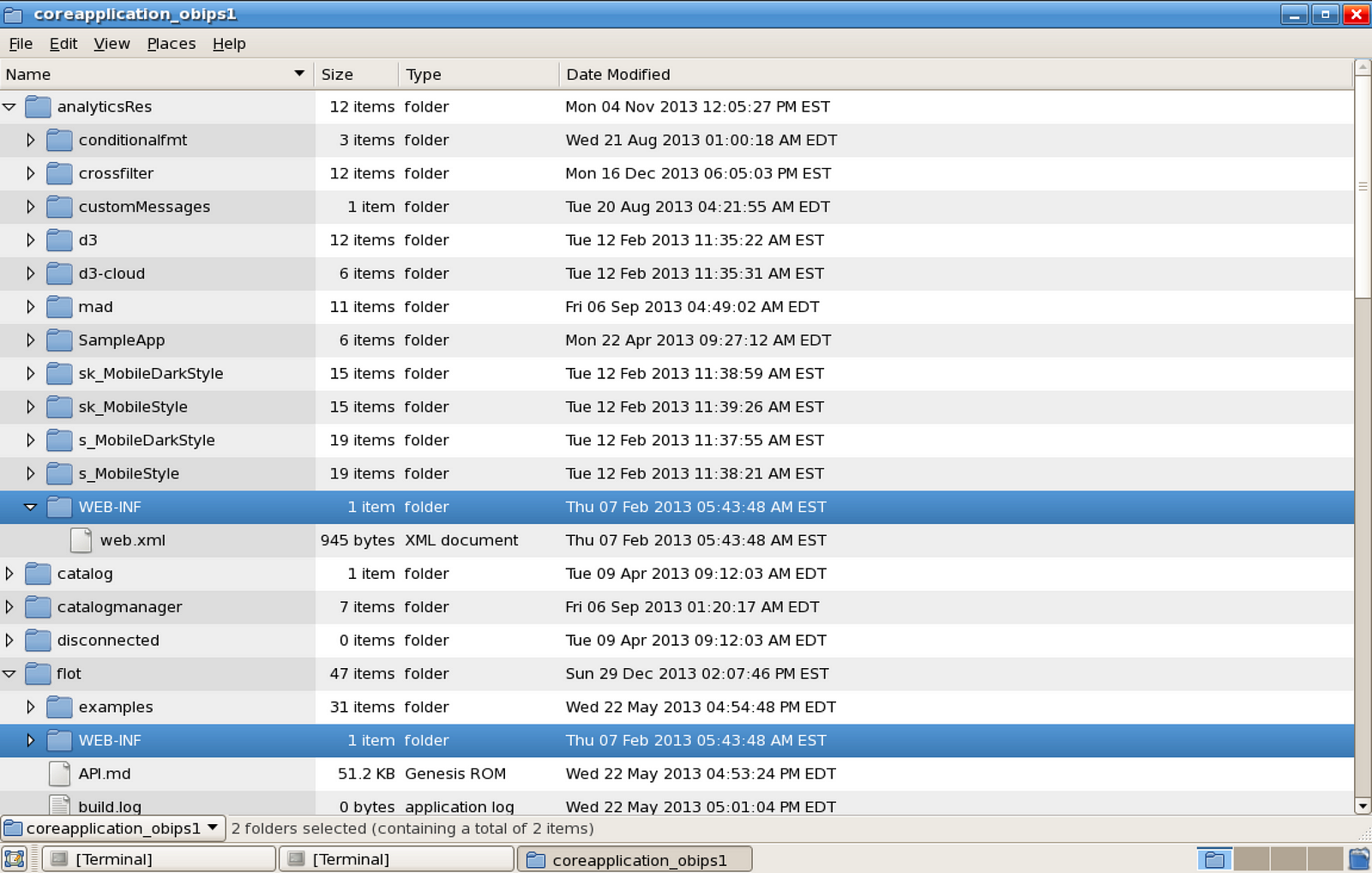
First, decide where to install the files. You can skip these steps by dropping the files in a folder inside analyticsRes, since that is already deployed to WLS, but there are reasons you may not want to do this. Regardless, you will want to copy the WEB-INF directory from analyticsRes into your library folder (flot in the above screenshot) because it contains a crucial file (web.xml) that instructs WLS to treat this folder as a deployable web application.
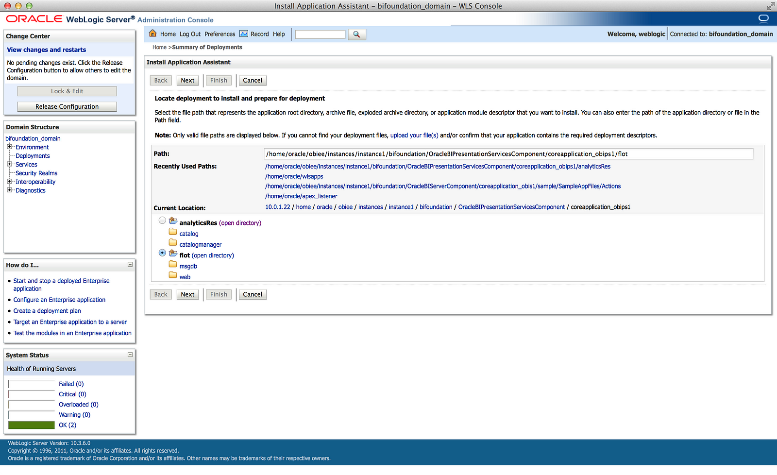
Next, log into WLS, go to Deployments in your domain structure, click the Lock & Edit button, and select Install. This will take you to the screenshot above where you will past the full path to the library directory. I’m using SampleApp 309R2 and installing Flot at the same level as analyticsRes. You can see the full path in the screenshot. Typing Enter after you paste the path should move you to the next screen, thanks to the WEB-INF folder.
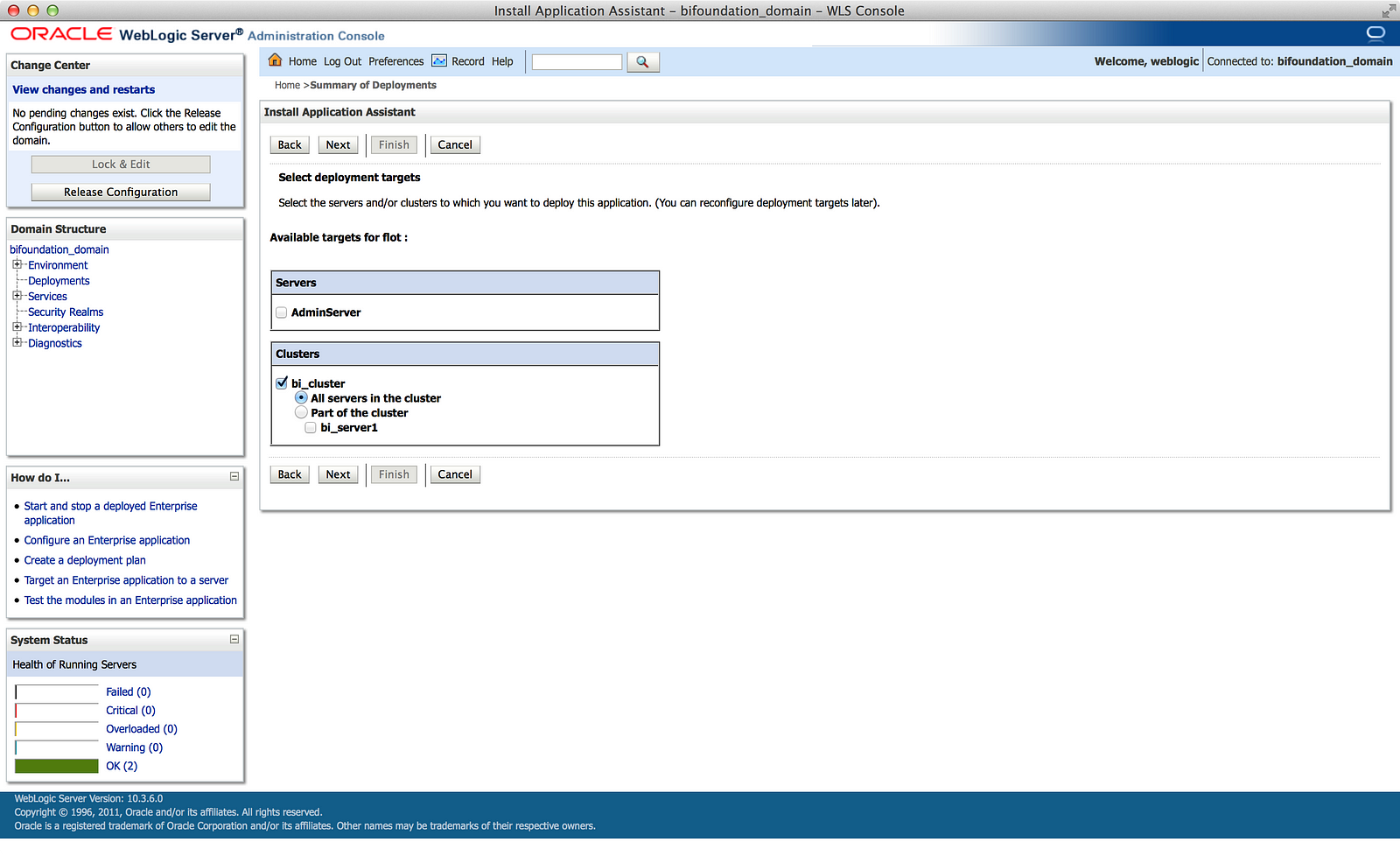
On the next screen, you’ll choose Install this deployment as an application and click Next, which will take you to the screen in the screenshot above — or at least something like it. Depending on your environment, this screen could look different. In general, you’ll want to make this application available to all machines in the cluster, so that will most likely be your consistent choice here. There may be an argument for/against using the WLS AdminServer, but I’m not savvy enough in WLS to make that argument.
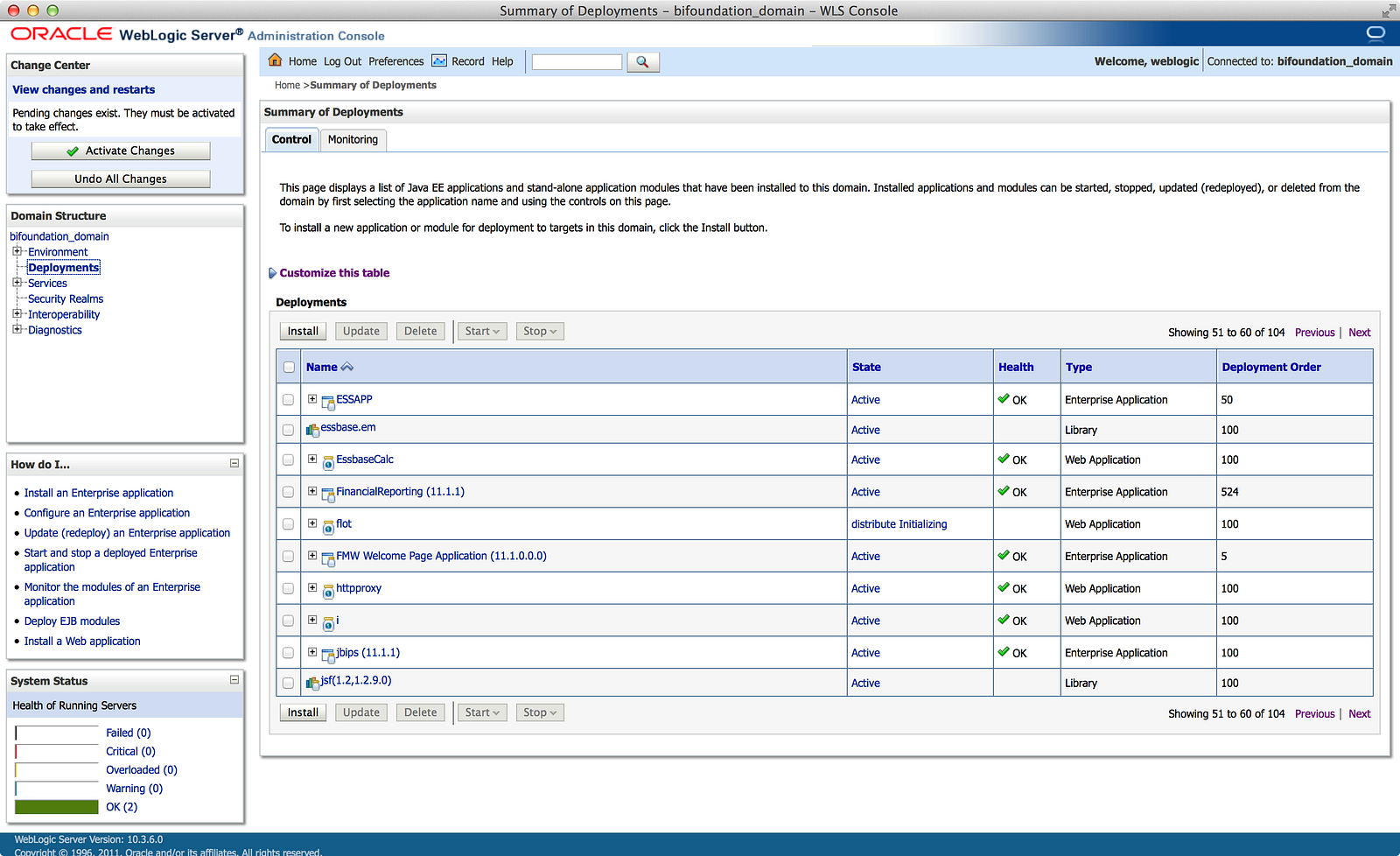
On the next screen, make sure to select I will make the deployment accessible from the following location before clicking Finish. From there you’ll be returned to the list of deployments and you can page through the list until you find yours, as I have done in the screenshot above. You’ll notice the Activate Changes button is present, which means we’ll need to do that now.
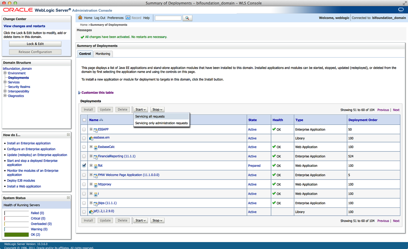
After activating the changes, the application will now be in a Prepared state, as in the screenshot above, and we can start the application by checking the checkbox next to it and selecting Servicing all requests from the Start menu. The application will now change to an Active state and you’re finished here.
The last thing I want to do before ending this blog post is to quickly review how the Narrative view works in OBIEE, because this will be your primary interface to construct any visualization using Flot, D3, or any of the other libraries available.
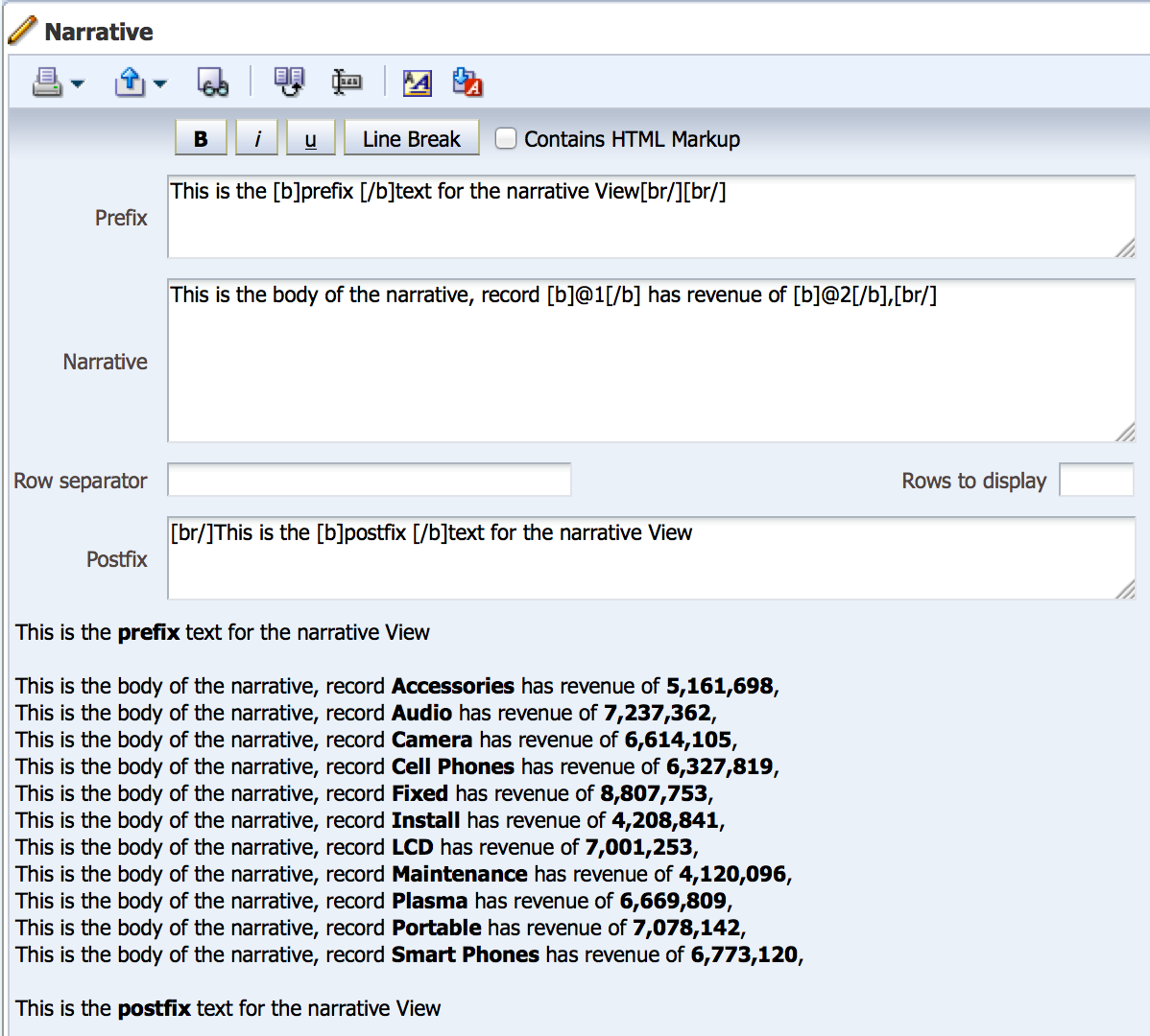
Above is a screenshot from a Narrative view in SampleApp, and below is a description of each of the fields in the view:
- Narrative — this is the core field of the view which basically acts as a loop for every row in the report, or the value set in Rows to display. As you can see in the screenshot, we are able to reference criteria columns using the “@n” syntax where n equals a column’s position in the criteria. You can type whatever text you want, insert “@n” where you want to reference a data value, and can format the text using simple formatting options or HTML markup.
- Prefix — this is simply a block of text that gets rendered before the Narrative block.
- Postfix — this is simply a block of text that gets rendered after the Narrative block.
- Rows to display — as mentioned before, you can control how many rows get rendered in the Narrative block by hard coding this to a specific value, or leave it blank to grab everything.
- Row separator — if you need to insert a block of text or markup between each row (handy if you want to put the rows into an HTML table), you can enter it here.
Now that you have a library deployed and understand the basics of the narrative view, I’ll show you how to reference the library in Part 2.