
Keeping Tabs on Tableau
Tableau has been around for awhile now and is sort of the “name brand” when referring to new cloud and lightweight BI platforms. Given its stature I thought I would download the newest version (Tableau 10), kick the tires, and see what it’s all about. You can download a free trial and test it for yourself, or download Tableau Public, which is a bit more limited in functionality, but has no trial period.
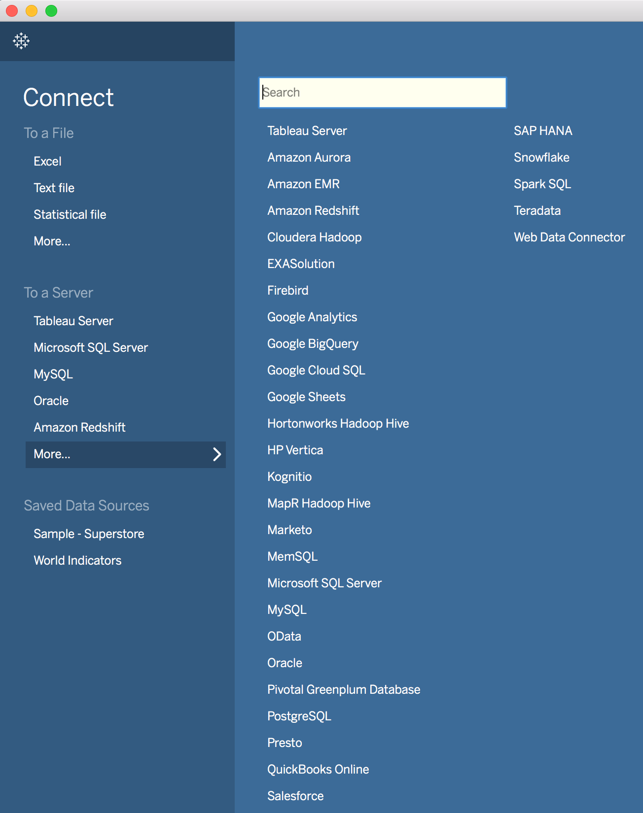
Tableau has a lot of connectors to various data sources that should cover virtually any datasource you may have. For this demo, I will not be using any of the powerful connectors like the one to a Snowflake database. I will be using the old standby Excel as my data source, as I did in my demos of Oracle BICS and Domo. As always, Excel files will need to be in a format that can be queried, so click here if you want to learn smart ways to do this.
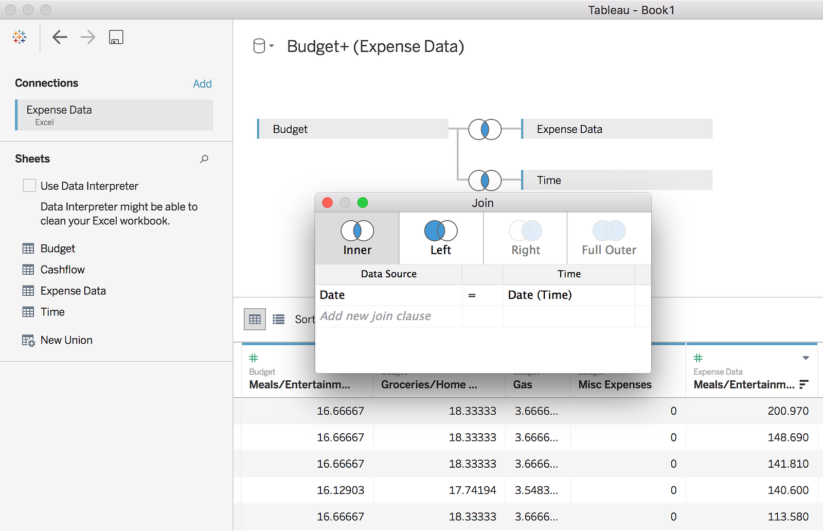
Getting data into Tableau is pretty straightforward. Tableau has a basic data modeling tool which is very easy to use, though somewhat limited on features. It doesn’t seem that you can do any sort of join where the operator is anything other than equals, for instance greater than or less than. However, in this example I don’t need to use those so the tool works fine for my purposes. Tableau, like Oracle BICS comes with a built in time dimension so in this case it is unnecessary for me to join in my self created time dimension, but I am going to do it anyway because I already have it and it is really my only “Dimension”.
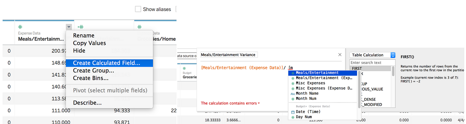
While configuring data sources you also have the ability to add calculated columns, versus having to create them in the analysis, which is also supported. I found it pretty easy to create a calculated column as all you need to do is start typing and a list of available columns pop up, the downside to this being if you have a lot of columns and don’t remember the name off hand it will require a little guesswork.
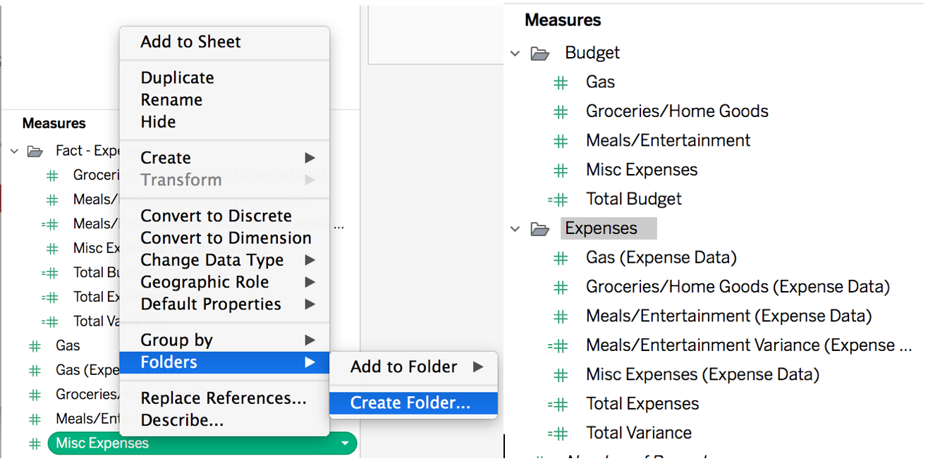
Now that I have all of the metrics I want to play with, I am going to organize my columns under folders and create an analysis. To create a folder you simply click on the metric you want to put under a new folder and say create folder and label it. Interestingly, presumably because Tableau doesn’t let you do subfolders, you can only add a folder if the metric you click on isn’t currently in a folder. If you want that metric in a new folder you need to remove it from the folder and then you can select “Create Folder”.
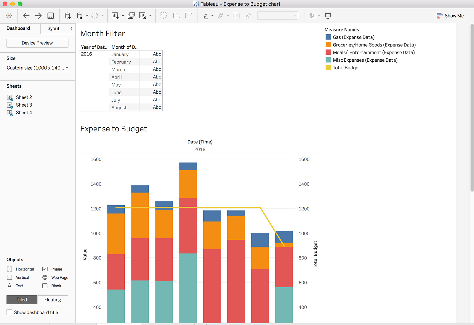
Now that I have everything set up the way I want, it’s time to create an analysis. Tableau, like the other new BI tools, is responsive and has simple drag and drop features. I really like the “back” button to easily undo changes (which I used quite a bit). In this analysis I used a combination stacked bar and line chart of individual expenses to total budget. This is the same visual I have done in all of my BI demos with this data set. It was rather tedious to get this set up and of all the tools I tried, it was by far the most complicated for this simple analysis. The process for getting this to work involved quite a few steps. First I had to drag the Measure Values “measure” into the Rows section, then I put my expenses down in the Measure Values section. The reason you have to use the Measure Values measure is so that it will group all of your measures in one stacked bar, versus making separate bar charts. I then drug my Total Budget measure across to the right side of the visual to create a secondary axis. Since my budget tops out at 1200, where as my expenses top out at 1570 the axes were not of the same scale, so I had to right click on the secondary axis to synchronize them.
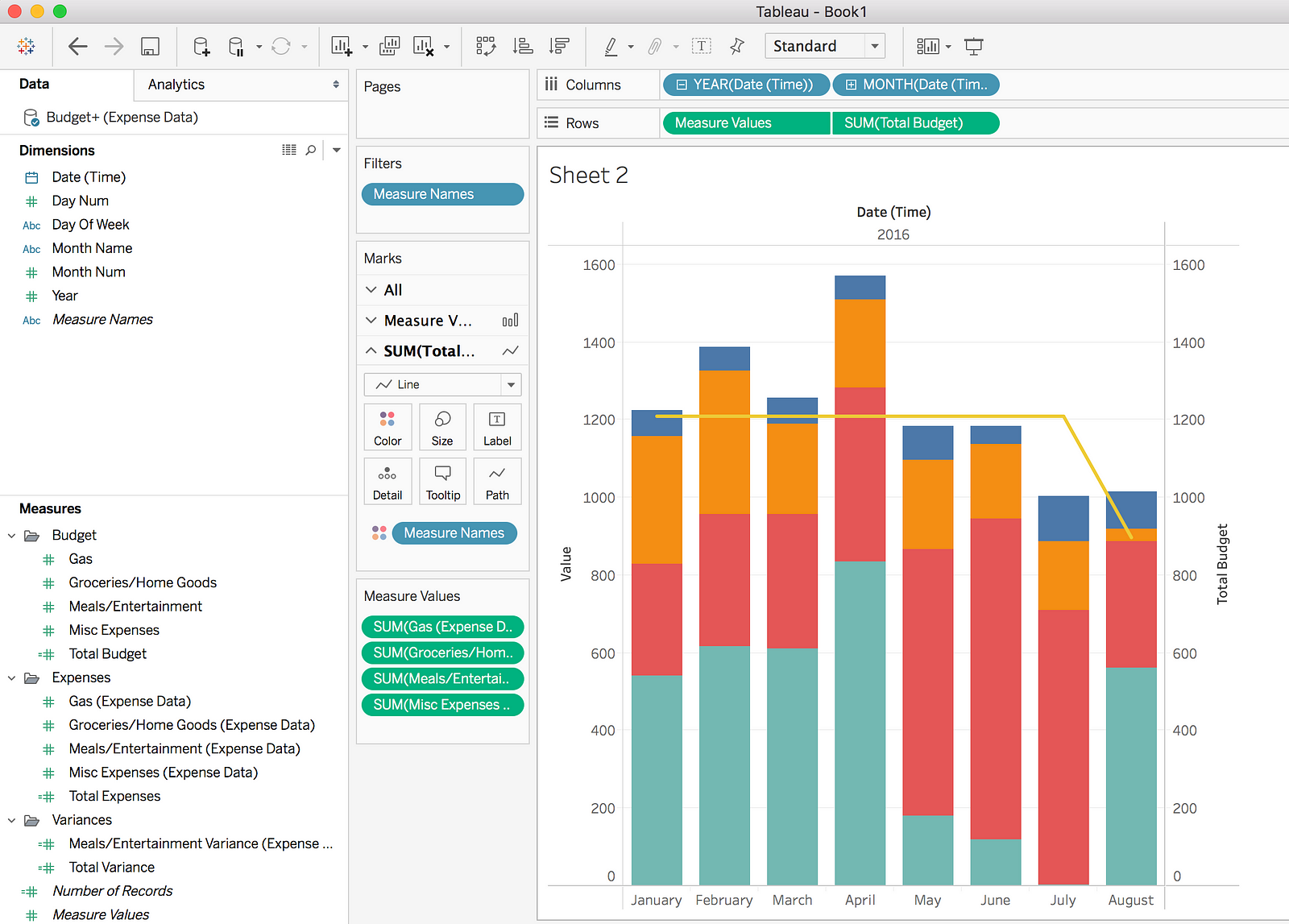
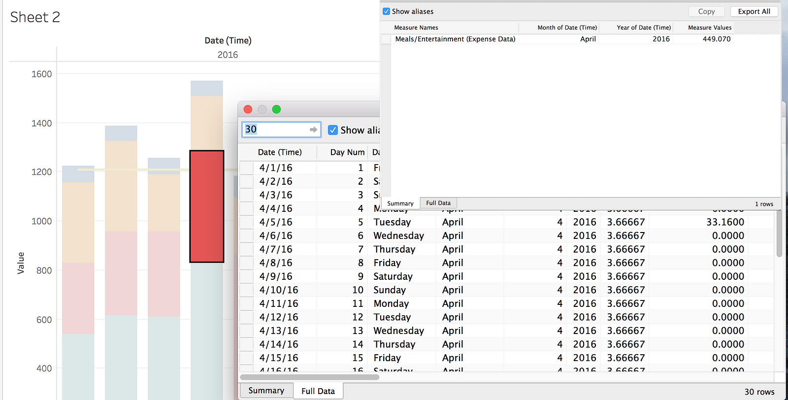
If you want to drill down on a specific field you just click the bar and select the button that looks like a table and it will show you the sum of all of those values. If you want to see the detail “drill down” select “Full Data”, however the problem here is this isn’t just going to show you all of the entries for “Meals/Entertainment” expenses, this shows you the full table view, which in this case is all expenses and all budget items for this month. This isn’t a big deal since I don’t have that many columns in my data set, but if I had a lot of columns this will be very messy to look at. Fun fact: once I had the chart the way I wanted it, I went to save it when Tableau quit unexpectedly; good thing it at least saved my report before croaking, so I didn’t have to redo it.
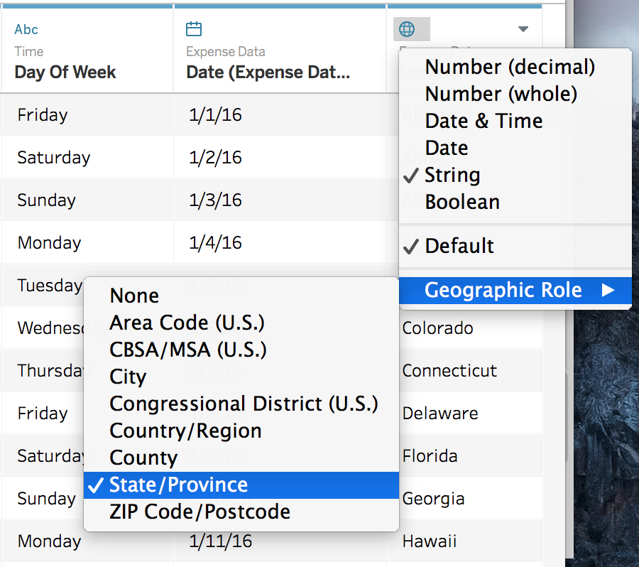
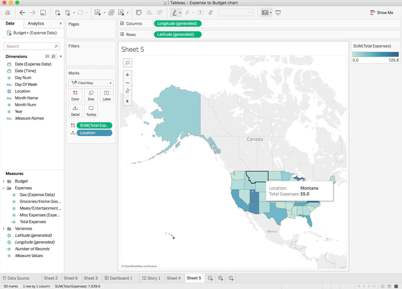
The cool feature that everyone gets excited about in Tableau specifically and other BI platforms in general are the map views, which allow you to view your data geographically. Tableau does an exceptional job in this area as it’s very easy to buid a map view on a basic data set. For example, I created a state for each row of expenses in my Excel data sheet. In the Data Source this shows as a text field, all I had to do was change it to a Geographic type.
Once this has been listed as a geographic role it can be used in a map view. I just drop total expenses into my map and voila, I can see where I have spent all of my money.
Now that I have created some analyses, lets move this into a dashboard. Tableau continues the drag and drop approach here where you can select your analysis and drop them on the dashboard. Creating filters for the dashboards seems to be a bit convoluted. There may be other ways to do this, but the way that I found was to make a report with the filter criteria I wanted and then drop it in the dashboard, right click on it and choose “use as filter”. You will notice that I have “Abc” in my filter, this automatically appeared when creating the report and I could not get rid of it other than by just shrinking the column, which is not ideal.
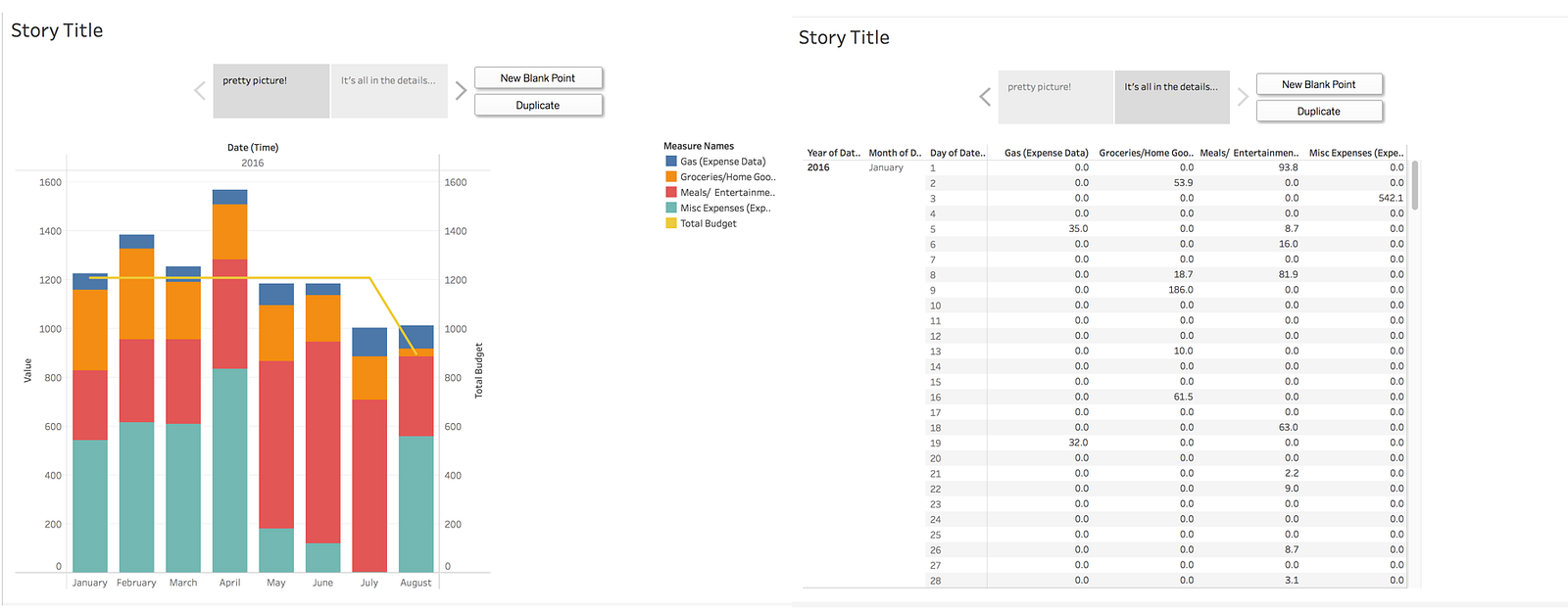
One pretty cool feature of Tableau that is really useful for presentation purposes or delivering a set of reports that tell a “story” is the Story board. This allows you to create separate analyses, put them on separate tabs and add a description to what you are trying to convey. You could use them to slice and dice the data different ways to lead the consumer to the point you are trying to make, or in my case just put one graph on the page and the next page a detail table.
After my experience working with both Tableau Desktop and Tableau Public (not pictured) I have mixed feelings about it. It is easy to get data into and set up, has lots of connections to where that data can come from. It is a more powerful tool than some of the new comers to the space. However, I find myself a little let down by the total experience of creating analyses and dashboards in the tool. Yes, it gives you a fair amount of visual and analytic functions to play with. However, like in my example of creating the stacked bar chart with a line, getting the analyses to display properly can take quite a bit more work then the marketing folks at Tableau would like you to believe. So in the end, I think it is a decent BI option if you don’t have any other BI tools already and you are looking for more of a self service tool(end user driven), but I don’t really buy into all the hype that still surrounds it.
One Response to Keeping Tabs on Tableau