
The Cage Match between OBIEE Answers and Data Visualization
Last week I presented at the BIWA Summit a “Cage Match” between Oracle Business Intelligence (OBIEE) Answers and Data Visualization. In full disclosure, these slides were created by Kevin McGinley and I simply was the presenter of these slides. However, I believe that I set the bar high for when Kevin presents these next. 🙂
This session was meant to compare the existing Answers tool from Oracle Business Intelligence with the new Data Visualization tool now available in 12c on-premise or cloud. The slides including a step-by-step screenshot of the demo can be found on slideshare here: http://www.slideshare.net/michellekolbe/obiee-answers-vs-data-visualization-a-cage-match.
Here’s my short narrative about what you missed in this BIWA Summit session.
The session began with a whistle (I’m not kidding. Just wait till you hear what else happened!). To start the match, I set the stage: Data Visualization is new and cool and looks like Tableau which is the tool that everyone thinks they want. But Data Visualization is another license cost and is it really something that all of your users need?
“Let’s Get Ready to Rumble” — Yes I actually played a clip of that song as our match started. And yes, I’m the referee of this match.

The Objective of this Match is that we’ll try to answer the same business question with each tool. The tool to complete the objective first earns 7 points. Due to the condensed nature of this session (only 30 minutes), we only had 1 objective. We wanted to figure out why profits decreased last quarter.
It’s important to note here that when we are doing an analysis and trying to dig into our data, there’s often a journey to get to the answers. What you might at first think is going to answer your question might lead to more questions or down different paths. This is where Data Visualization succeeds because it is easy to quickly view the data and drill into it at different levels or in different ways of visualizing.
I’m not going to walk through each step in the demo in this blog but I’ll call out the highlights.
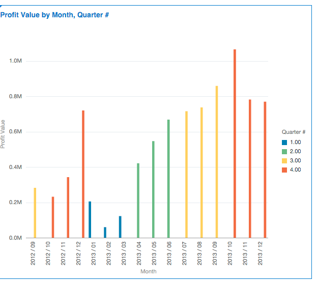
In Data Visualization within a minute we could see that quarter 4 of this year decreased in profits whereas last year increased by using color by on a bar chart.
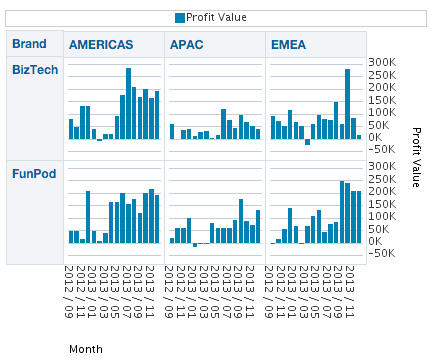
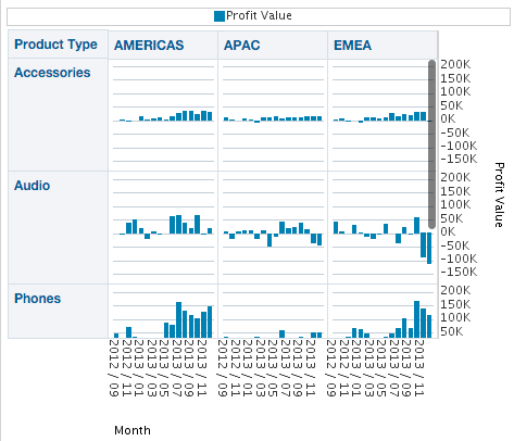
By creating a Trellis chart with Brand & Region I could see that EMEA for the BizTech brand saw a sharp decline in Profits whereas other regions and brands did not have the same drop.

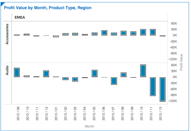
I want to look at EMEA specifically and drill into the BizTech brand to the Product Type level. Now I can see that the Audio product type had some problems.
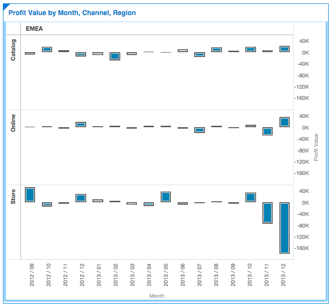
Next I drill Audio by Channel to see that Store is the Channel that had a decrease while the others increased.
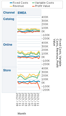
Now that I know where the problem was in terms of region, channel, brand and product type, I want to figure out which part of the Profit equation was the problem. You’ll recall that Profit = Revenue — Costs. Let’s add these two metrics to our chart.
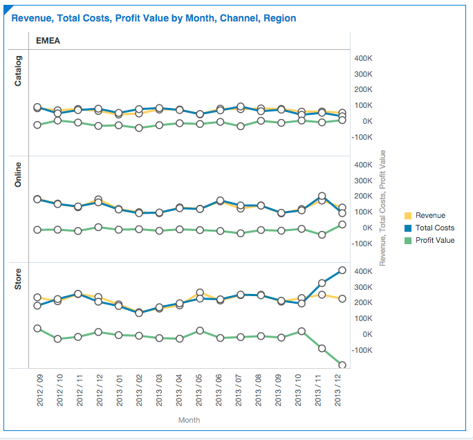
Ah! We are getting somewhere. Revenue stayed flat for Stores in EMEA for the Audio product type of the BizTech brand but Total Costs went up significantly which is what cut into our profits. Since Total Costs = Fixed Costs + Variable Costs, let’s look at these metrics specifically.
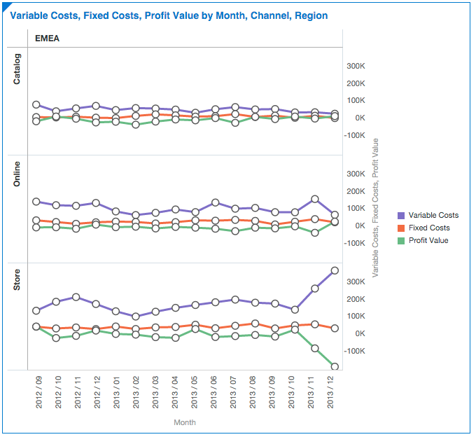
There’s our answer. Variable Costs significantly increased for this time period in EMEA for Audio products from the BizTech brand that were sold in our Stores which drastically reduced our overall Profit Value in Q4. This is the story that we can tell our executives but we wouldn’t need to go through all of these clicks in the analysis with them. This analysis took me less than 5 minutes to complete in Data Visualization with not too many clicks.
Now let’s do this same analysis in Answers. The steps are basically the same as above so I’m going to call out where the clicks weren’t as easy.
To start, Answers displays the data as a Table. When we ask for the Best Visualization, it leaves the table which we then need to remove.
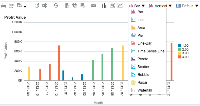
We change this chart to bar and add Quarter as the Color By. The next hurdle we come to is when we want to change this chart to a Trellis Chart. It’s not an option when editing this chart. We need to create a new chart as Trellis.
After moving the default columns around and pulling in Region & Brand, we have a Trellis chart which displays very tiny the same trellis that we saw in Data Visualization. This is the point where I threw the yellow flag for a foul! That was too many men on the field to make this work.
Next we want to drill on Audio. However in Answers we can’t skip a level like we did in Data Visualization so we first get Line of Business (LOB) then Product Type. We can move Brand and LOB to our Excluded columns to clean this up.
At this point as the Ref, I’m frustrated so I show the Red Card to kick Answers out of the game. This was a joke. I was mixing sports here. If you were in my audience, you wouldn’t have laughed because apparently sports jokes are not understood by the BIWA crowd. I guess we’ll keep Answers in the game just to complete this demo.
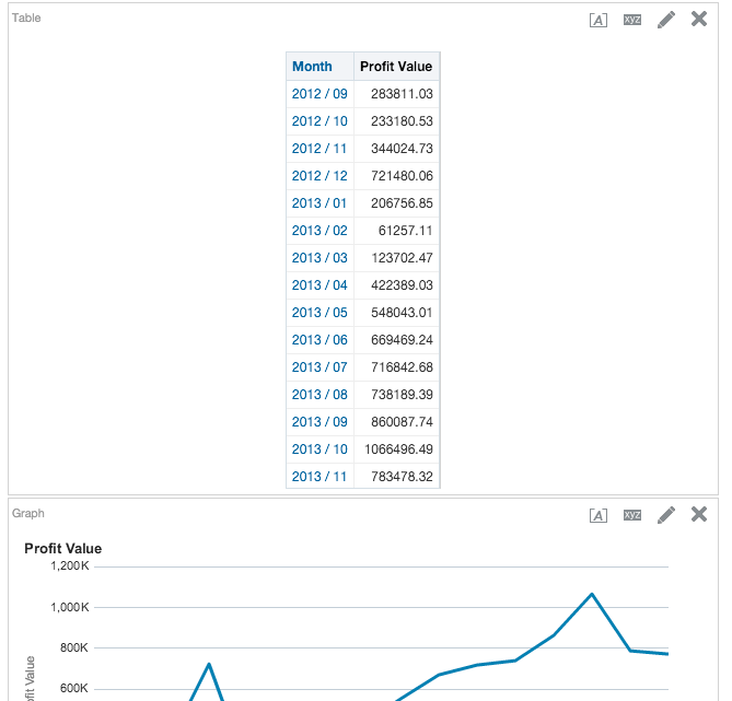
Now I keep only the Audio type and Drill to Channel by dragging it into the Rows. Then I change to a Line chart and add the Revenue and Cost metrics to get the final output of this:
It’s not as pretty but it did give us the same answer and we were able to do everything that we did in Data Visualization in Answers.
The final score?
So when would you use each?
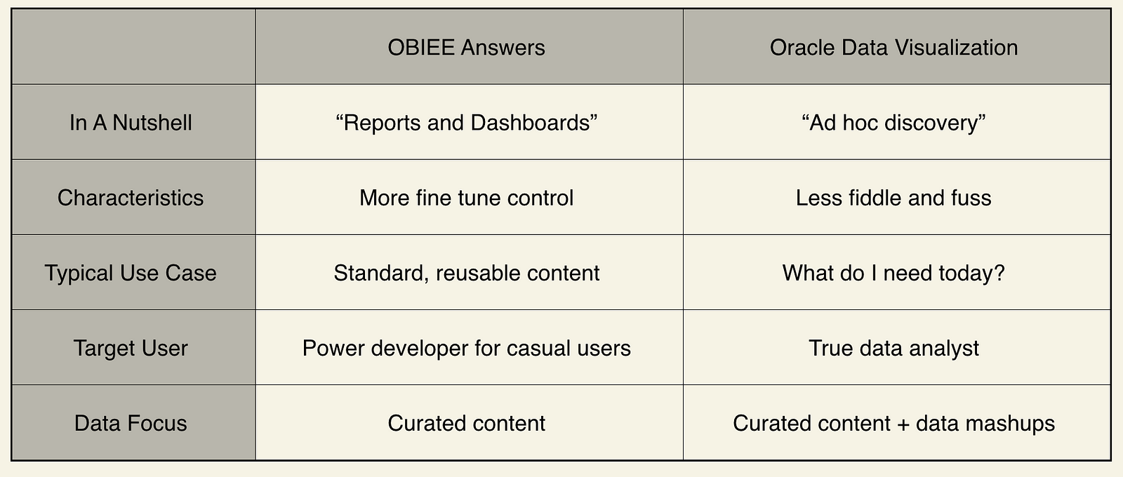
I think that the important aspect to call out here is that Data Visualization allowed me to much easier click thru the data so that I could focus on my analysis instead of how to get the data and information to a point where I could consume it easily. Data Visualization takes care of some of those details so that my analysis can be more efficient. However, it wouldn’t be a tool to give to all of your casual users, only the data analysts.
Also an important note here is that Data Visualization uses the curated content from your repository or your data metadata so that everyone has the same definition of the metrics and there’s no redefinition here. This is a notable difference from Tableau where the metadata layer is missing.
You’ll see that the table above notes that Data Visualization allows for Mashups where you can import data from spreadsheets into your analysis. That’s another big topic that should be covered in another blog.
Another question that the audience asked was if you can mix Answers reports with Data Visualization reports in the same Dashboard. The answer to that right now is No but Oracle is working on a solution to that request.
In the end, Data Visualization won this case study due to the ease of use but ultimately either tool would have helped us arrive at the same answer.
2 Responses to The Cage Match between OBIEE Answers and Data Visualization