
In Part 1 of this post, I wrote about why you might want to add third-party visualization capabilities for OBIEE and gave a brief explanation how to setup one approach: calling java visualization engines. In this post, I’ll give a simple and a more advanced example of how to do this specifically in one of the engines: Flot. In Part 3, I’ll do the same for D3.
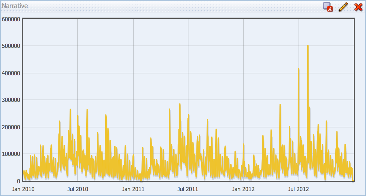
I’m assuming at this point you’ve done the setup steps in Part 1 and have the Flot library deployed as an application in WLS. This will allow us to reference the libraries in a Narrative view. So how do we code a simple chart like the one above? Let’s start with the base report in SampleApp:
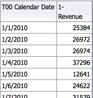
Pretty simple, right? I have a metric, “1 — Revenue” and I want to line plot it by “T00 Calendar Date”. The first thing you need to know is that things will always be a little harder using these third-party engines when compared to OBIEE. The benefit of the out-of-the-box charts in OBIEE is simplicity, but the trade-off is unlimited configurability. As you can imagine, the benefit/trade-off is reversed when considering the third-party engine.
Our primary challenge here, before beginning any coding, is that Flot doesn’t use time the way OBIEE or the Oracle database does, but rather how Javascript does. According to the Flot documentation:
The time series support in Flot is based on Javascript timestamps, i.e. everywhere a time value is expected or handed over, a Javascript timestamp number is used. This is a number, not a Date object. A Javascript timestamp is the number of milliseconds since January 1, 1970 00:00:00 UTC. This is almost the same as Unix timestamps, except it’s in milliseconds, so remember to multiply by 1000!
So, we need to take our “T00 Calendar Date” column and convert into the number of milliseconds since 1/1/1970. Easy enough, right? Well, it turns out to be a little bit more complicated than you think, so let’s walk through that quickly.
- Convert “T00 Calendar Date” to a timestamp — for whatever reason, this was not a straight CAST for me, as OBIEE didn’t like casting a date as a timestamp (even though that is supposed to be supported) so I went through a varchar instead: CAST(CAST(“Time”.”T00 Calendar Date” AS VARCHAR(20)) as TIMESTAMP)
- Create a column for our base timestamp — since we’ll have to find the difference between two timestamps, we need the starting point described in Flot’s documentation (we need to be mindful of the date syntax here): CAST(‘01-Jan-1970′ as TIMESTAMP)
- Calculate the difference between the two in seconds — there is a nice little function called TIMESTAMPDIFF which allows us to calculate the time between two timestamps, choosing between a preset list of granularities. We want seconds, and in the function syntax you specify the earlier timestamp first if you want positive numbers, so we have this: TIMESTAMPDIFF(SQL_TSI_SECOND, CAST(‘01-Jan-1970′ as TIMESTAMP), CAST(CAST(“Time”.”T00 Calendar Date” AS VARCHAR(20)) as TIMESTAMP))
- Convert seconds to milliseconds — this should be as easy as multiplying by 1000, right? Sadly, OBIEE didn’t like me adding a simple “*1000″ to the end of the above formula, so I had to cast the result of the above formula as a double precision value, then multiply by 1000 like so: CAST(TIMESTAMPDIFF(SQL_TSI_SECOND, CAST(‘01-Jan-1970′ as TIMESTAMP), CAST(CAST(“Time”.”T00 Calendar Date” AS VARCHAR(20)) as TIMESTAMP)) as DOUBLE PRECISION)*1000
Side note: if you plan to use Flot alot (snicker snicker), you may want to create the Javascript timestamp column in the database or at least in the RPD so you don’t have to go through this formula every time.
After all that nonsense, you have a table like this (showing the four different formulas above):
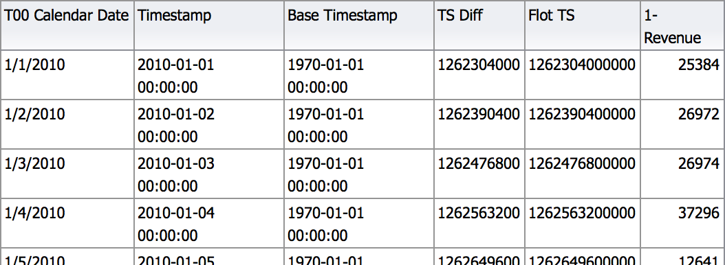
Now we can plot the “Flot TS” column along with “1 — Revenue” on our simple Flot chart!
To create a simple Flot chart, we need four basic things:
- A reference to the correct Flot library files
- A data array
- A Flot plot statement
- A div container to render the Flot plot
Let’s look at the finished product first, then we’ll break down what we’re doing in the Narrative view:
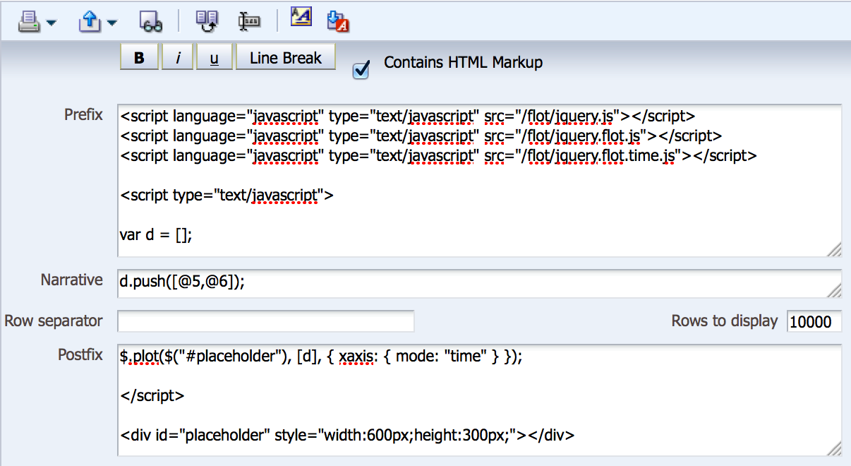
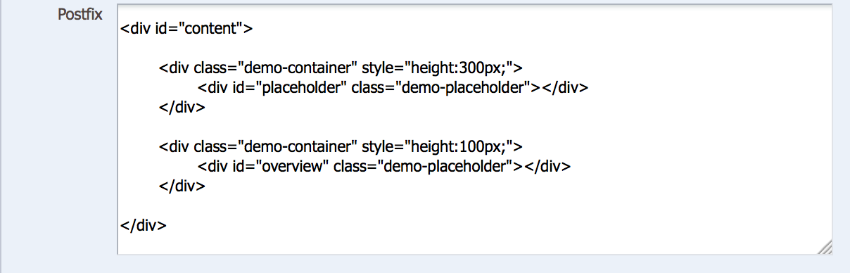
Prefix
There are three main things we are doing in the prefix of the Narrative view:
- Identifying our Flot javascript files
- Initializing our script that will create the data array and generate the Flot chart
- Initializing our data array
In the first step, you can see that the location of our .js files is a “flot” directory residing right off the base “server:9704″ URL, or http://server:9704/flot. This is the application we created in Part 1. The other thing worth noting is that because we are using timeseries data, we must include the jquery.flot.time.js file. From there we just need to initialize our script with a simple <script> tag and initialize our data array by creating a variable “d”.
Narrative
If you recall from Part 1, the Narrative section is nothing more than a loop through every row of the report, and we can reference data columns however we need to using the “@n” syntax. In this case, columns 5 and 6 of the report are the columns we want to plot in the chart, so we use a javascript “push” command to write records into the array for each row in our report.
Postfix
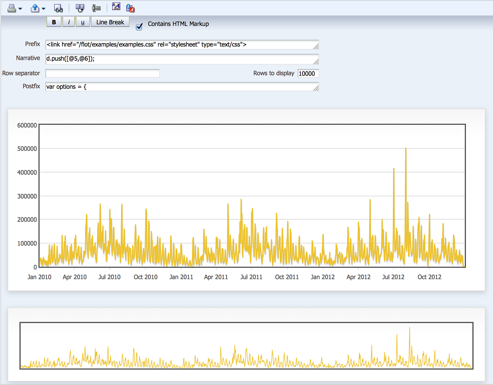
To end the code, we need to use the Flot command “plot” to generate the chart. In this case, our syntax is fairly simple in that we plan to render it using the name “placeholder”, feed our data array “d” into the plot, and our xaxis will get intelligently rendered as a “time” axis (more on that in a moment). From there we add a simple end-script tag, and add a div tag to render the chart, calling our “placeholder” name and giving it whatever size we want. And voila:
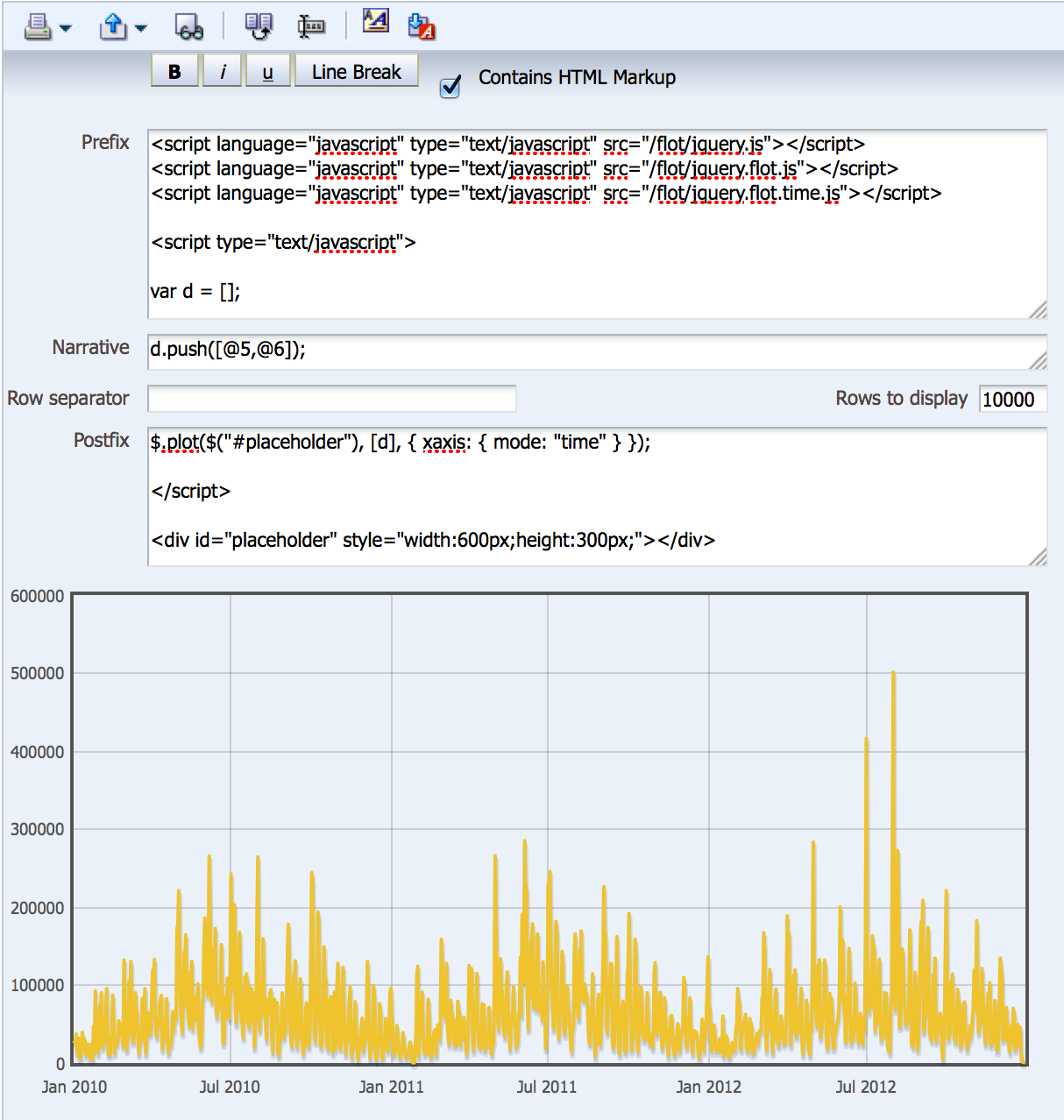
The astute reader will notice that I have added “10000″ in the Rows to display field in the Narrative view. Why did I do this? When I first coded the chart without any value in that field, as is the default for all Narrative views, the chart looked like this:
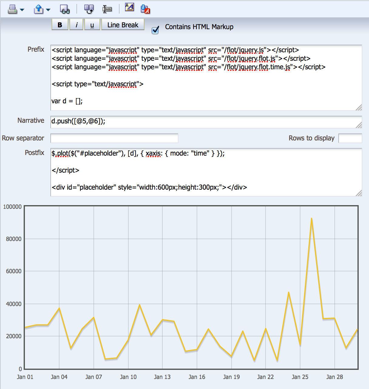
Notice how the chart ends with the end of January? Why did it do that? I’m not sure, but adding a large value like “10000″ into the Rows to display field forced it to render the entire chart. What’s also interesting about this behavior is notice the difference in the x-axis between the two screenshots: the first one above uses month in the x-axis label and the second uses date in the label — all without me changing anything about the columns fed into the report. Thanks to our jquery.flot.time.js file, the chart is time aware based on how much data it needs to render. What if the end user could control this somehow, without having to go into the Narrative view definition?
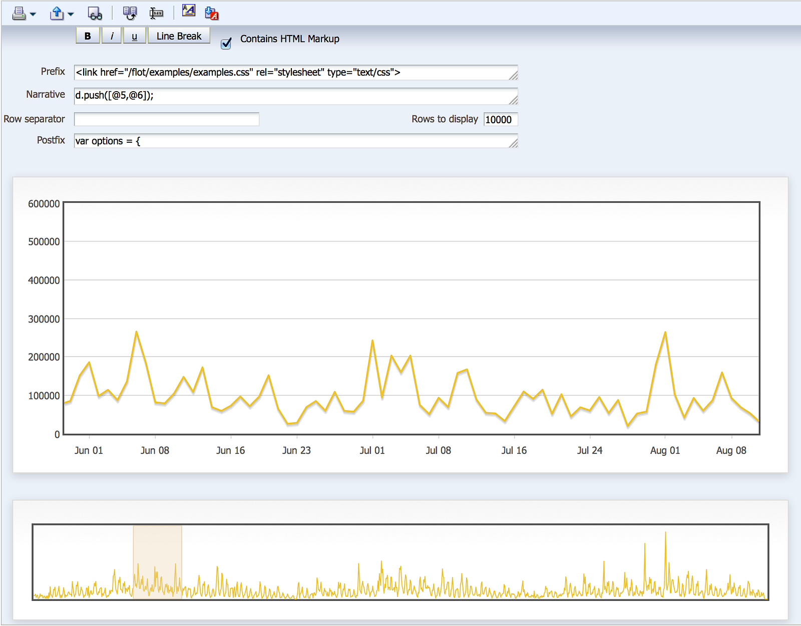
That leads us to one of the cool interactive examples I mentioned in Part 1: the ability to control the range of time displayed on the chart by dragging the desired range on a second “overview” chart. Think of this as master-detail linking in OBIEE, but on your master, you can actually drag and draw on the master chart. Let’s look at how the code in this Narrative view differs from the first one:
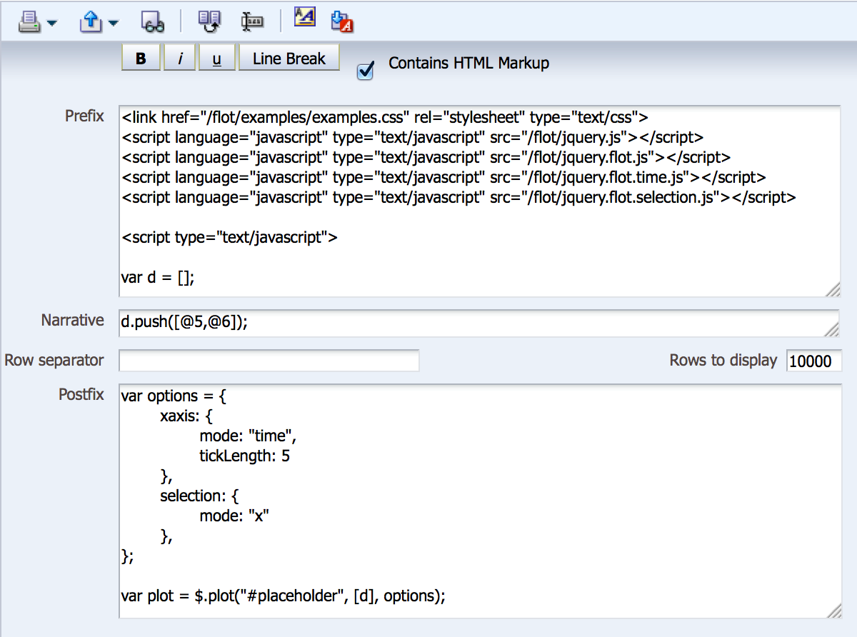
Most of the differences are in the Postfix field, and since it’s quite long, we’ll look at it across multiple screenshots. But first, there are two main things added in the Prefix field to note: reference to a css file, demonstrating you can use css to control the look/feel of the charts, and reference to the jquery.flot.selection.js javascript file, which will allow us to draw on the one chart and use some code to bind that selection to the other.
How does this get assembled in our Postfix field? Before I get into that, I want to point out that I didn’t code this by hand. Thanks to the examples on the Flot website, I was able to look at the source code and borrow quite a bit from the examples. If you’re going to venture into building visualizations like this, be prepared to do this frequently, because the documentation typically only covers the basics and looking at the code for other visualizations will help you immensely, especially when we get to the more complex D3 in Part 3.
Back to our Postfix field, you can see we have our $.plot command like we had in the first example, but this time there are two distinct differences: we reference the “options” or configuration of the chart in a variable called “options” (surprise!), and we put the plot command in a variable called “plot” (surprise again!) so we can reference it later as we redraw the chart for a specific range. The “options” variable is handy when you have multiple options that you don’t want to clutter a single $.plot command with. I actually trimmed some of the options from the example I found to simplify this example, but you can see I left in something like “tickLength” which controls the xaxis label tick mark length. It’s worth stating again that OBIEE helps the developer by putting all of these controls in a properties box, but you’re limited to the controls that it puts there. Now let’s move further down the code:
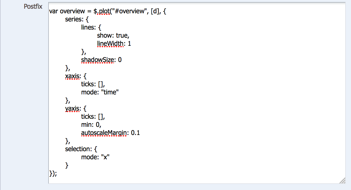
Here were generating the second chart — the overview chart — and storing it in a different variable. In this case, the chart options are directly specified in the $.plot command, which makes for messy code (in my opinion). For the most part, these options should make logical sense to you, especially when you look at the finished product. Scrolling further down, now we get this:

Thankfully, the developer who coded the example included some commentary that helps me explain this next section. First, we’re using a $.bind command to have the “placeholder” chart listen to the overview chart (much like master-detail channels in OBIEE) and upon receiving a range from the overview chart, we update the “plot” variable with options that constrict the chart to the range selected. However, we don’t want our overview chart to redraw itself upon drawing the range, so the next $.bind command simply sets the ranges and doesn’t update the overview $.plot variable. We end with the rendering code:
The only thing different about this code is that we’re rendering two div containers and referencing the css class to format the charts, which look different from our first example in that they have white backgrounds and nice shadowboxes, as seen below:
And our ability to select a range looks like this:
That concludes Part 2 and two simple examples of generating charts using Flot. Part 3 will examine how D3 works to generate its visualizations.