
Whether you are using Excel as a data source for your Business Intelligence (BI) platform, or you are doing the actual analysis within Excel, your data will need to be in a format that is queryable. Often though, the data is formatted to be read visually, whether an export from a system, or manually entered. If you are reading this article you are probably already aware that it can be a pain to format data for analysis.
For example, suppose you have the following sample expense tracking spreadsheet with a weekly view format:
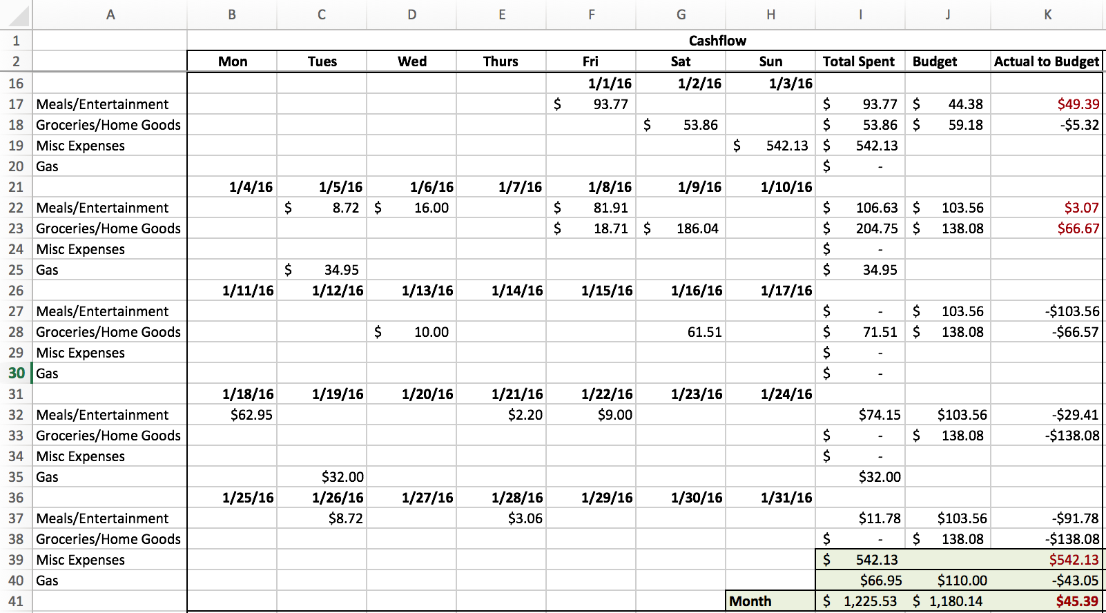
It’s easy to enter data for each category and date and the display is user-friendly. However, if I want to look at trending, or pivot it, or do any sort of analysis, I can’t. But I could if it were presented in a columnar fashion like this:
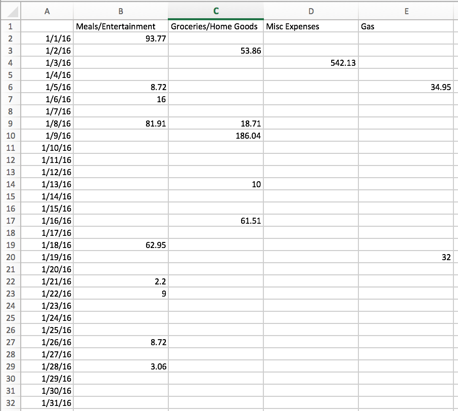
How do you get here? Obviously, you could get to this point by manually searching and inputing the values, but that sounds horrible and you are better than that. The good news is that as long as the data is presented in the same way each time you need to clean it up (like in this example), it doesn’t have to be a challenge. In fact, if you put in the effort up front, it can be fun and easy (okay I know fun is a bit of a stretch). How do you do this? Answer: Macros! Little bits of VBA magic we can use to format data in Excel.
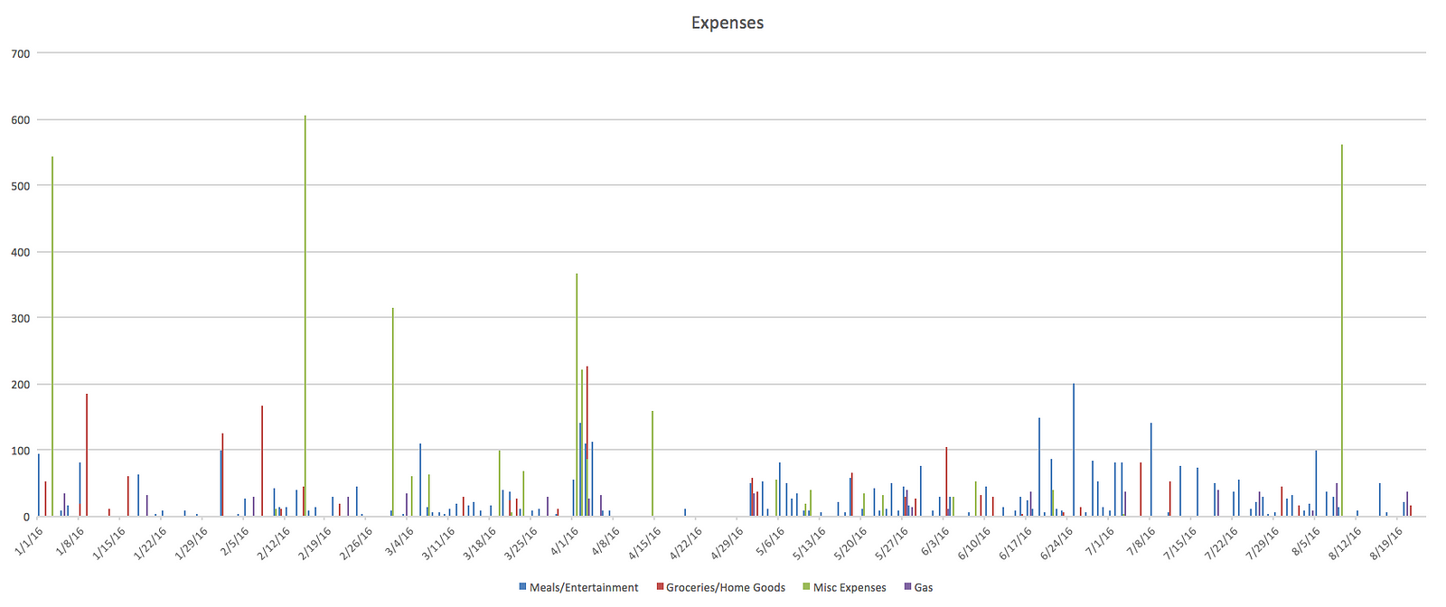
The code for this example is comprised of three parts. First, there is the setup to add categories and some initial formatting. Then there is a do loopto create all of my dates, and I assume all expense data is up to date when the routine is run, so the loop stops at the current date. Lastly, there is a findfunction wrapped in a do loop. While attempting to create the find function, I couldn’t find a good example of exactly what I was looking for in Google. So I think this should be a useful example and you can see how I did this in the link at the bottom of the article. The find function essentially goes through each category for each day and copies the contents of that cell into the corresponding row and column of the table to create something that is queryable and can by used to create the analysis you want. A simple bar chart in Excel might look like this…
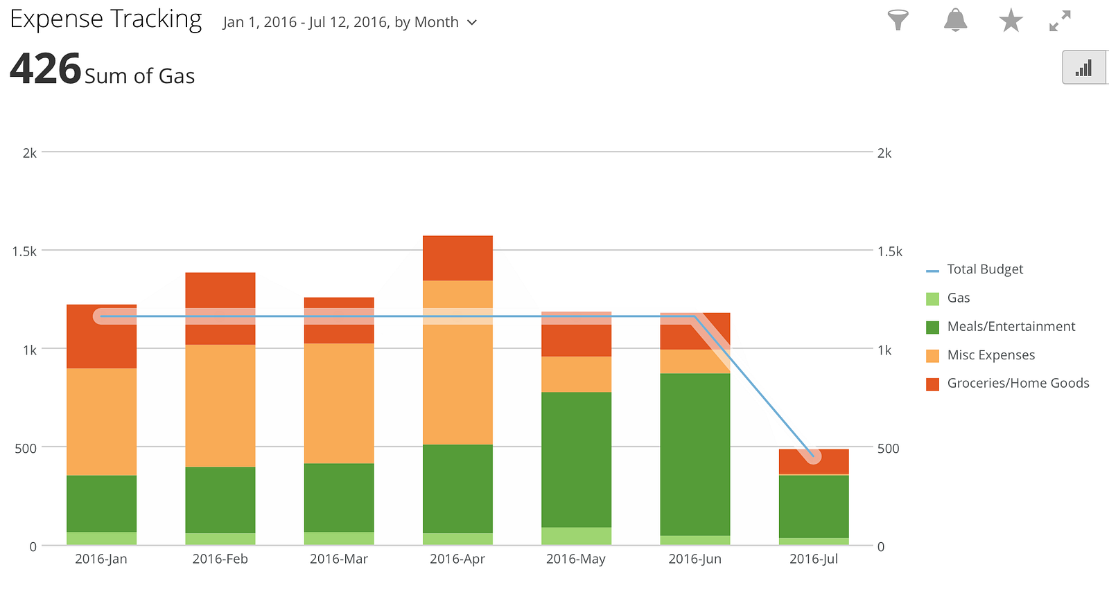
…or you can upload this sheet into your favorite BI Tool and maybe join it up with other tables and create something like this.
Now this is just one example of preparing data in columnar format, but in most cases you can use similar principals to prep your data however it is presented. If you want to try this out for yourself using my example and look at the details of how I did this, you can check out my project on GitHub.