Trending Up
Using the Trend Line Function in OBIEE 12c
One of the new features in OBIEE 12c is the availability of an “internal” R instance. This instance will allow the execution of R scripts, and the folks at Oracle have been kind enough to include some functions out of the box with the OBIEE 12c install for us to try. In this post I’ll cover how to use the Trend Line function from the available out of the box functions.
The Trend Line Function
Trend lines can be a divisive topic — some say they are “chart junk”, others claim trend lines can be good visuals to have in complex graphs. I fall in the latter camp and think that it can be a tool for good if used appropriately, and like most techniques in BI and analytics, we have to take care to accurately describe what we’re doing so it isn’t misconstrued. So, without further ado, let’s breakdown the function and it’s components.
Trend Line Syntax
Here is the function as it is seen in OBIEE 12c:
TRENDLINE(<numeric_expr>, ([<series>]) BY ([<partitionBy>]), <model_type>, <result_type>, [<number_of_degrees>])
You may be wondering what those parameters mean and what the options are. I’m glad you asked; let’s work our way through this function.
<numeric_expr> is the fact column you want to trend, and represents the Y Axis on a graph.
<series> is a dimension column on which you want to trend your fact column. This represents the X Axis of the graph, and a sort order (either ASC or DES) can be applied within the series parameter. ASC sort ordering is defaulted, and be aware that if you would like to trend multiple fact columns within an analysis, they must have the same series column selected.
<partitionBy> parameter is a list of dimension columns that you would like to include in your trend. These are dimension columns that are not on the X Axis, and add a richness to your Trend Lines (I’ll provide examples below).
<model_type> is the type of model that you would like to execute. There are two types: LINEAR and EXPONENTIAL. LINEAR models use constants when determining the curve (the trend line) and should be used for most simple trend lines (as it will be a straight curve), while EXPONENTIAL models will use an exponential function, meaning that the curve could change to fit the data set. Oracle documentation says to only use LINEAR, but both options work, as seen below.
<result_type> represents the type of output you will see. There are two options: VALUE and MODEL. The VALUE option will return the value of the regression analysis, while the MODEL option returns the parameters in a JSON string.
<number_of_degrees> is an optional parameter, and used only in polynomial models.
Trend Line Examples
Now that we’re familiar with how the Trend Line function is put together, let’s make some practice trend lines. I’m using Sample App 607 with the installed R packages, and using the “A — Sample Sales” subject area for those following along at home.
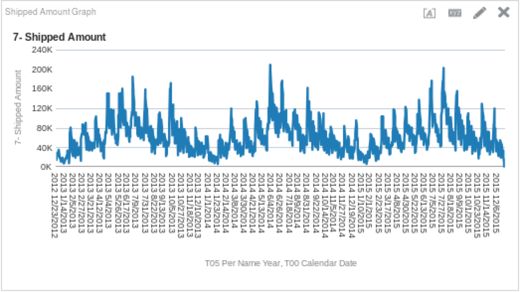
I created a simple analysis that is only a few columns to get started. I selected “T05 Per Name Year”, “T00 Calendar Date” and “7 — Shipped Amount”, and plotted these on a line graph.

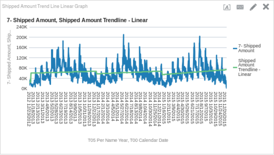
Once I had taken a look at the data coming back, I decided it would be nice to see how it would trend. Here is the function I used, which will return a linear model’s results:
TRENDLINE("Base Facts"."7-Shipped Amount", ("Time"."T00 Calendar Date"), 'LINEAR', 'VALUE')I then placed the trend line measure on the graph to get the following view.

By looking at this, we can see that shipments are cyclical, and trend upwards throughout the year only to dip again after the new year. How does the trend line look if we use the exponential function? Let’s try it. Create a new column in the criteria tab and use the logic below as the column definition.
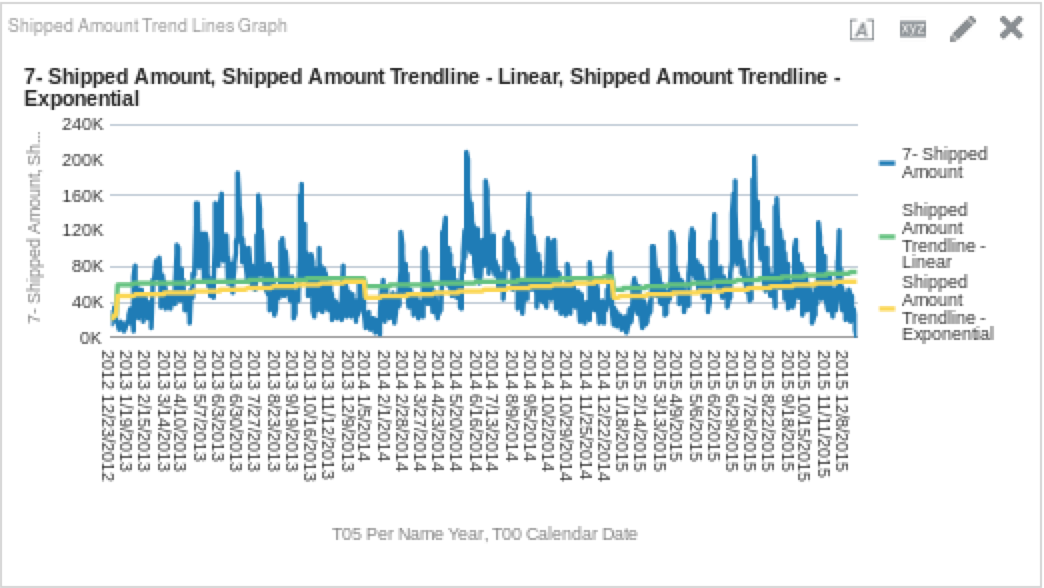
TRENDLINE("Base Facts"."7-Shipped Amount", ("Time"."T00 Calendar Date"), 'EXPONENTIAL', 'VALUE')Once you have created the column, add it to the graph. You should see something like this:

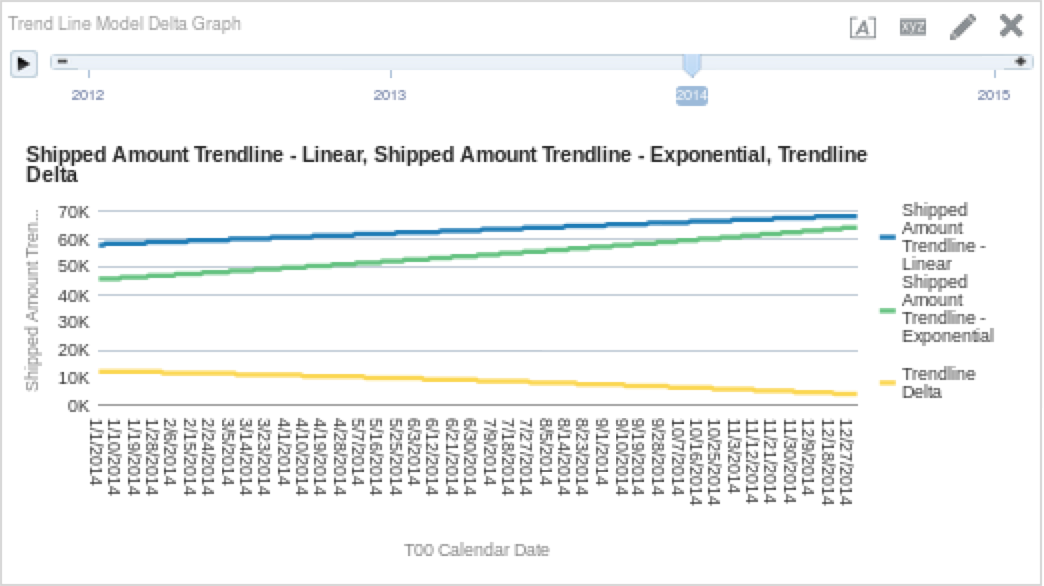
So again, we can see a similar trend each year, but it appears that the exponential curve dips lower at the beginning of each year. If you’re really nerdy and want to see the delta between the linear and exponential functions, you could create a column that subtracts one from the other. The results of which may look like this:

Just as we suspected, we can see that throughout the year, the delta between the two models gets smaller and smaller. Which one is correct depends on how simple or complex your model is (and if you decide to listen to the Oracle documentation or not), but I think that the main point here is that in a simple analysis like this one, the differences are not earth shattering.